The brief
What makes the best digital planner
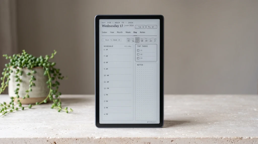
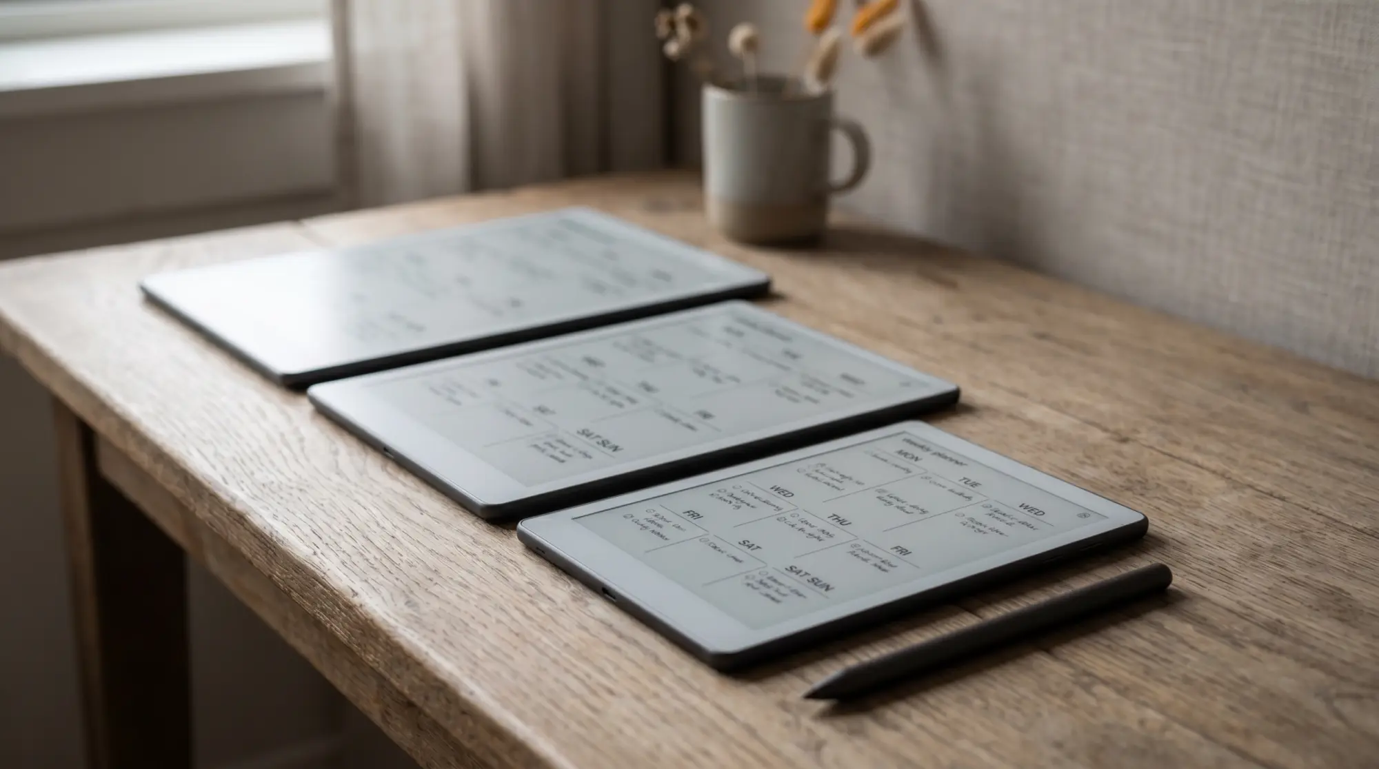
A digital planner is a planner PDF, built with tappable links, that you load onto an e-ink tablet and write on by hand. The best digital planner does three things a paper diary and a calendar app both miss: it holds your whole year in one file, it jumps from a year view to a single day in one tap, and it lets you write rather than type, on a matte screen that does not glow or notify. That combination, a connected structure you navigate by pen, is what separates a planner you live in from a pretty template you open twice. The rest of this guide is how to choose one that fits your tablet and the way you plan, instead of one that looks tidy in a screenshot and goes quiet by February.
Four qualities decide whether a digital planner earns its place. It has to be hyperlinked, and the links have to reach: working month tabs are the low bar, and the real test is how many taps the longest trip in the file takes. It has to be dated to a real year, ideally two, so the calendar is built for you. It has to be made for your specific tablet, because link spacing, margins, and page proportions are all tuned to a screen size and a pen. And it has to hold together as one connected system rather than a folder of pages that share a style. Get those right and the planner becomes the one place your time lives.
- Hyperlinked, and measured: a tap from year to month to day, and a short, countable trip to the deepest page in the file
- Dated: the year mapped out for you, ideally two years so the planner carries forward
- Device-made: sized for your reMarkable, Kindle Scribe, or Boox, not a one-size file
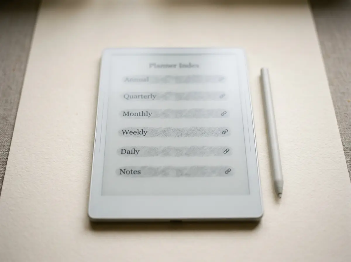
- Connected: a core of Index, Year, Month, Week, Day, and Notes that link as one system
That first quality is the one worth pressing on, because page count is the number every listing advertises and it hides the thing that matters. A 300-page planner you cannot navigate is a worse year than a 90-page one you can. Ask for tap distance instead: from any page in the file, how many taps to any other page. Almost nobody in this category publishes that figure, so asking for it sorts the shortlist quickly. We hold our own files to three taps or fewer with no stranded pages, and the Digital Work Planner is the one that passes today, at 297 pages with every pair checked. The rest of the line is being rebuilt to the same limit, so treat that as one product’s number rather than a claim about ours in general. The digital planner guide has the longer version of the test.
Tablet first
Match the digital planner to your tablet
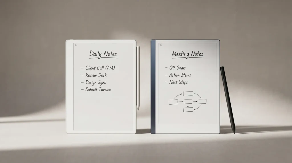
The most common mistake is choosing a planner before checking it suits the tablet you own. A file built for a 10-inch writing surface can feel cramped on a smaller reader, and a layout made for one pen can ignore the pressure and palm rejection of another. So start from the hardware. The three tablets people plan on, reMarkable, Kindle Scribe, and a writing-capable Boox, all write beautifully on e-ink; what differs is the software around them and the size of the page. A planner sold per device exists for exactly that reason. The table is the short version of which suits which planner.
| Tablet | Best for | Reading | App flexibility |
|---|---|---|---|
| reMarkable | The calmest, most focused planning | Good for PDFs, no store | Closed, focused |
| Kindle Scribe | Planning plus reading in one device | Strong, full Kindle store | Limited, reading-led |
| Boox | Planning plus any Android app you want | Good, install any reader | Open Android |
If you are still choosing the tablet itself, our reMarkable planner and Kindle planner guides go deep on each, and the short version is that none of the three is wrong. Decide the device for how you read and which apps you need, then buy the planner built for it, not the other way around.
Which one
Which digital planner is right for you
Once the structure is sound, the choice comes down to how you plan and what else the tablet has to do. The matrix below maps what you most want from the device to the planner variant that fits it, which is a faster route to a decision than weighing every spec.
| If you want most | The planner that fits | Why |
|---|---|---|
| Calm, distraction-free writing | The Planner for reMarkable | A focused device with the closest paper-like feel |
| One device to read and plan | The Planner for Kindle Scribe | Plan and read from the Kindle store on the same screen |
| Apps beside the planner | The Planner for Boox | Open Android runs the work or study apps you cannot drop |
| A planner shaped to one role | Any variant plus an add-on pack | Budget, Fitness, Professional, Student, Teacher, or Wellness pages slot in |
That last row matters more than it looks. A strong digital planner is not one rigid file; it is a core you extend. So a budgeter, a lifter, and a student can all start from the same connected planner and add the pages their life needs, which our digital budget planner and digital student planner guides each cover in depth.
The structure
What a good digital planner includes
The page count on a planner listing tells you almost nothing; the structure tells you everything. A good digital planner is built as one connected system rather than a stack of loose templates, and the spine of that system is six sections that link to each other. An Index sits at the centre as a hub you can always tap back to. A Year view holds the shape of the whole twelve months. A Month opens from the year, a Week opens from the month, and a Day opens from the week, each a single tap down or back up. A Notes section catches everything that does not belong to a date. When those six are genuinely cross-linked, navigating the file never costs you writing space, and that quiet connectedness is the difference between a planner and a folder of pages.
From that core, the best digital planner extends rather than bloats. Instead of one overstuffed file, you add the pages your life actually needs, a budget section, a fitness log, project pages, student trackers, on top of the same dependable spine. That keeps the everyday planner light while letting it grow into exactly the tool you want, which is a far better model than a single file trying to be everything to everyone and succeeding for no one.
Dated or not
Why a dated digital planner beats an undated one
A dated file is what turns a planner from a blank book into a tool that is ready the moment you open it. A digital planner dated 2026 and 2027 has the months built, the weeks numbered, and today one tap away, so you start planning rather than ruling up a grid first. An undated planner asks you to date every page yourself before you have written a single appointment, which is busywork most people abandon within a fortnight. The dated file does the opposite: it carries you from one year into the next without a second purchase, so the plans and notes you make this year are still there next year rather than expiring on the 31st. A printed book ends with its year by design, and that annual repurchase is the main reason people start comparing hobonichi alternatives each September.
The two-year span is the part that compounds. A planner covering 2026 and 2027 lets you look back across a full year of weeks to see where your time really went, and forward into the next without starting over. That continuity is the whole reason to keep a planner rather than a pile of disconnected notes, and it only exists when the file spans the years instead of ending with the calendar.
An undated planner asks you to date every page yourself before you have written a single appointment, which is busywork most people abandon within a fortnight.Why dated wins
In practice
Setting up your digital planner
Once the planner is loaded, a few habits decide whether it sticks. Spend the first sitting setting the year up, dropping in the dates you already know, so the file is live before the week gets busy. Plan from the top down, year to month to week, so the day always sits inside a bigger picture rather than floating on its own. Keep your notes in the planner rather than a separate app, so everything is one tap from the date it belongs to. Back the file up to cloud storage, because a digital planner is a single PDF and a lost tablet should never mean a lost year. And add only the sections you will actually use; the best digital planner is the one you open every day, not the one with the most pages.
A planner is one of those tools that only proves itself over a real year, so if you have run a digital planner across a few months, tell us in the comments which sections you live in and which you never open. The honest list of what people actually use is worth more to the next reader than any feature count, and it helps us keep building the planner around how people really plan.
FAQ
Common questions, answered briefly
What is a digital planner?
Which tablet is best for a digital planner?
Should a digital planner be dated or undated?
What sections should a digital planner have?
Can I use the same digital planner on Kindle Scribe and Boox?
If yours isn’t above, drop the question in the comments and we’ll add it.
People also ask