The brief
What the best digital student planner needs to do
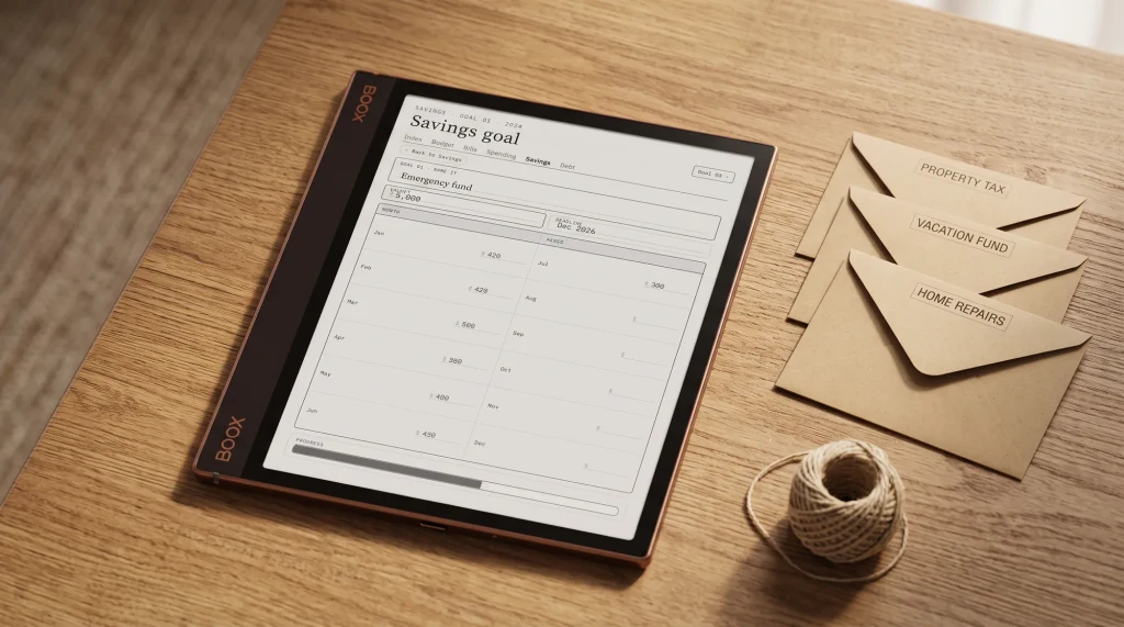
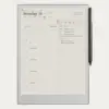
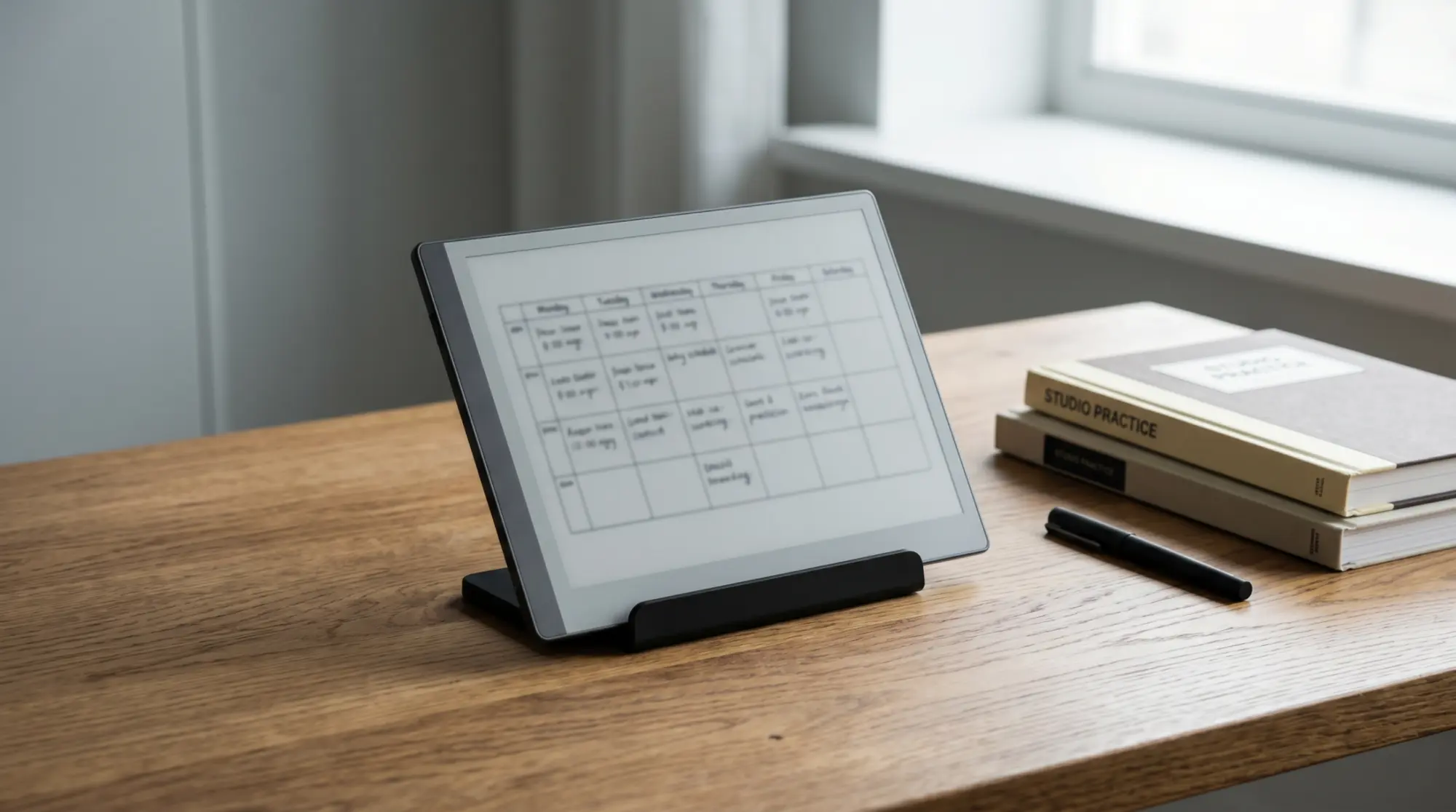
A digital student planner is a planner PDF, built with tappable links, that you load onto an e-ink tablet and write on by hand. The job it does is simple to state and easy to get wrong: it has to hold your term at a glance, take you from a month to a single day in one tap, and give you somewhere to capture lectures and track what is due, all in one file you actually open. A blank notebook can do some of that, but it cannot jump from a deadline to the right page, and a phone app cannot match writing by hand on a matte screen. The planner sits in the middle, and the rest of this guide is how to choose one that fits your tablet, your course, and your year rather than one that looks tidy in a screenshot and then goes unused by week three.
Three things separate a planner you keep from one you abandon. It has to be hyperlinked, so navigation is a tap and not a scroll. It has to be dated to a real academic year, so the weeks and months are laid out for you. And it has to carry the pages a student actually uses, which is a narrower list than most bundles admit. Get those three right and the device becomes the only thing you carry to class.
- Hyperlinked: tap from year to month to day, and jump straight to notes or the assignment tracker
- Dated: the academic year mapped for you, ideally two years so it carries forward
- Pen-ready: ruled and gridded pages sized for handwriting, not just typed entry
- Focused: a term calendar, class notes, an assignment tracker, an exam countdown, and little filler beyond that
Tablet first
Match the planner to your tablet
The most common mistake is choosing a planner before checking it suits the tablet in your bag. A planner built for a 10-inch writing surface can feel cramped on a 6-inch reader, and a file made for one pen can ignore the pressure and palm rejection of another. So start from the hardware. If you already own a reMarkable, a Kindle Scribe, or a writing-capable Boox, the planner has to be made or sized for it, because the link spacing, page proportions, and margins are all tuned to a screen. A good student planner is sold per device for exactly this reason, and a generic one that claims to fit everything usually fits none of them well.
This is also where the cross-device buyer wins or loses. If you are still choosing the tablet itself, our guide to a digital notebook tablet for students walks the trade-offs in full, and the short version is that all three brands write well on e-ink; the difference is software and ecosystem, not whether the planner will run. Decide the device, then buy the planner made for it, not the other way around.
The pages
The pages that earn their place
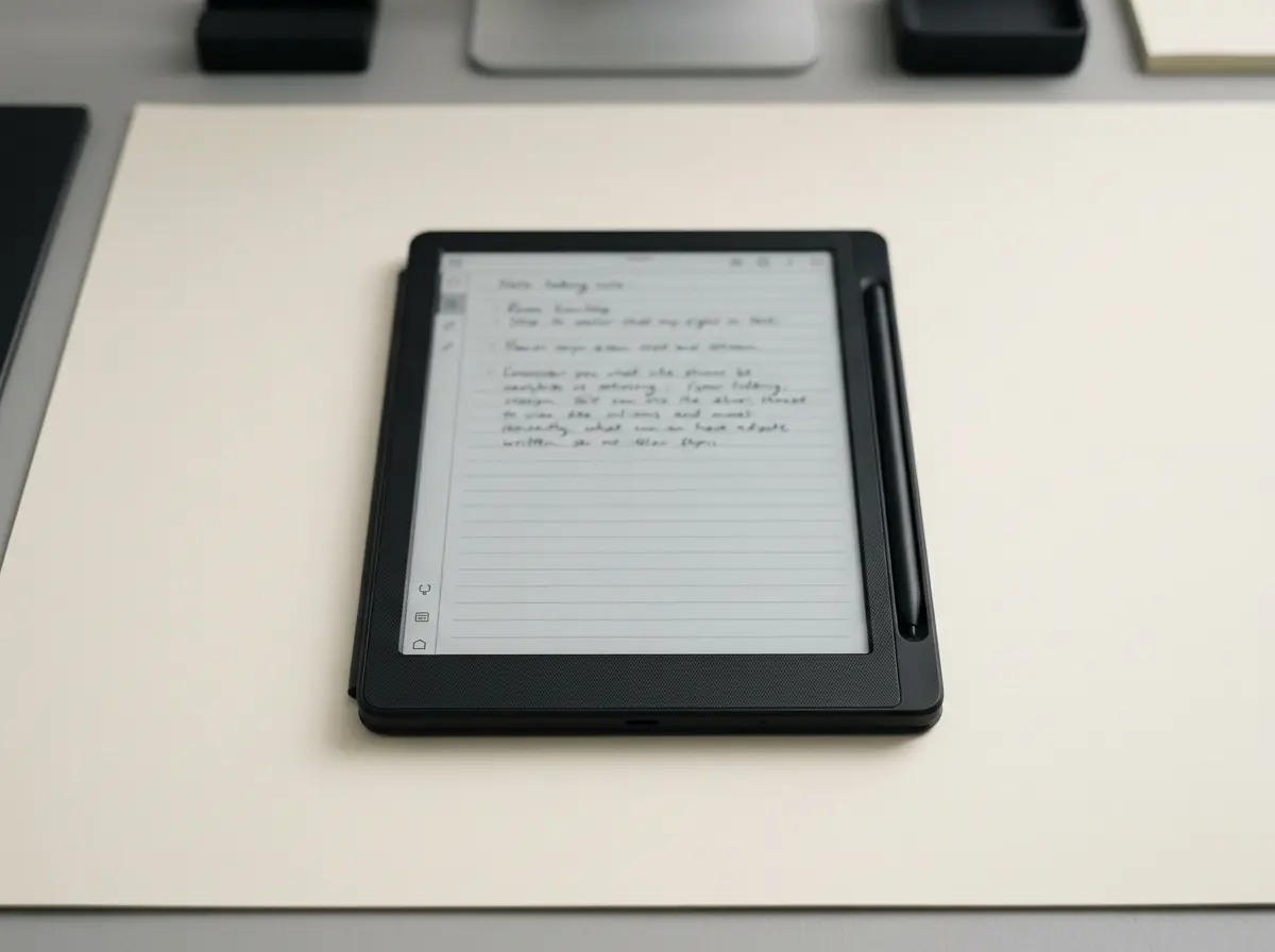
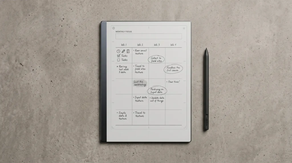
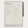
A student planner does not need fifty page types; it needs the few that map to how a term actually runs. The backbone is a dated term calendar, month and week, so you can see reading weeks, deadlines, and breaks in one view. Under that sit class notes, and this is where a structured note layout earns its keep: a cue-and-summary format, the Cornell method, turns a wall of lecture text into something you can revise from. We cover that layout on its own in our Cornell notes guide, and the official Cornell note-taking system from Cornell University explains why the cue column works for recall. If you want the sheet rather than the theory, our free Cornell notes template prints at Letter and A4.
The third piece is tracking. An assignment tracker that lists each task, its course, and its due date, plus an exam countdown for the weeks before finals, is what turns a calendar into a plan. Beyond those, a reading list and a simple grade log are useful; almost everything else is filler. When you weigh a digital student planner, count the pages you would open weekly and ignore the rest of the page count, because a tidy file you use beats a sprawling one you do not.
Device fit
reMarkable, Kindle Scribe, or Boox for student life
All three write well on e-ink, so the choice comes down to how each fits a student’s week. The table is the short version; the paragraph after it is the nuance.
| Device | Best for | Reading textbooks | App flexibility |
|---|---|---|---|
| reMarkable | Distraction-free notes and planning | Good for PDFs, no store | Closed, focused |
| Kindle Scribe | Reading plus writing in one device | Strong, full Kindle store | Limited, reading-led |
| Boox | Notes plus any Android study app | Good, install any app | Open Android |
If your study life is mostly note-taking and you want nothing pulling your attention, reMarkable is the calm pick, and a planner pairs with it the way our reMarkable planner guide lays out. If you read a lot of set texts and want one device for the library and the lecture, Kindle Scribe reads from the Kindle store and writes on the same screen. If you want to run a specific study app, a flashcard tool, or a PDF annotator of your choice, a writing-capable Boox gives you open Android, which our Boox Go 7 review gets into. None is wrong; they suit different weeks.
Dated or not
Why a dated planner beats an undated one for students
For most planners the dated-versus-undated debate is a real toss-up. For a student planner it is not. An academic year has a fixed shape, and a dated file lays that shape out for you: the weeks are numbered, the months are built, and the term simply opens to today. An undated planner asks you to write every date yourself before the year even starts, which is busywork you will skip by October. A planner dated 2026 and 2027 does the opposite, mapping this academic year and carrying you into the next without a second purchase, so the value compounds rather than expiring the moment term ends.
That two-year framing matters more for students than for anyone else, because your year straddles two calendar years anyway. A planner that covers 2026 and 2027 follows you from autumn into the new year and through to the next intake, which is exactly the span a degree is measured in. It is the difference between buying a tool for your course and buying a blank book you have to set up first.
An undated planner asks you to write every date yourself before the year even starts, which is busywork you will skip by October.Why dated wins
In practice
Getting the most out of a digital student planner
Once the planner is loaded, a few habits decide whether it sticks. Set the term calendar up in the first week, entering each deadline from every syllabus in one sitting, so the assignment tracker is live before the work starts. Keep class notes in the planner rather than a separate app, so revision pulls from one place. Back the file up to cloud storage, because a planner is a single PDF and a lost tablet should never mean a lost term. And resist the urge to collect page types you will not open; a digital student planner works because it is one focused file, and every extra section you bolt on is one more thing between you and the page you actually need.
A planner is one of those tools that only proves itself in a real term, so if you have run a digital student planner through a semester, tell us in the comments what you kept and what you never opened. The honest list of pages students actually use is worth more to the next reader than any feature count, and it helps us build the Student planner around the way courses really run. If you are on the other side of the desk, our digital teacher planner guide covers the same decision for a teaching year, and our best teacher planner comparison ranks the options by format.
FAQ
Common questions, answered briefly
What is a digital student planner?
Which tablet is best for a digital student planner?
Should a student planner be dated or undated?
Do I need Cornell notes in my planner?
Can I use a digital student planner on a Kindle Scribe?
If yours isn’t above, drop the question in the comments and we’ll add it.
People also ask