The layout
What a page of Cornell notes actually looks like
Cornell notes are a page layout before they are anything else. Draw a vertical line about a third of the way in from the left edge, then a horizontal line a few lines up from the bottom. You now have three zones, and each one has a job. If you would rather not rule them by hand, our free Cornell notes template is the same three zones already drawn, as a printable PDF and an editable .docx.
The wide field on the right is where you write during the lecture, the meeting, or the reading. Nothing about this part is special. It is ordinary note-taking, and the method does not ask you to change how you do it.
The narrow column on the left stays empty while you are writing. You fill it afterwards, with questions and keywords that point at what is beside them. The strip along the bottom stays empty too, until you can write the whole page as a few sentences from memory.
That sequencing is the entire idea. Two of the three zones are filled after the fact, which means the page cannot be finished in one sitting. The layout is a commitment device disguised as stationery.
Origin
Where the system came from, and the problem it was built to fix
Cornell University’s Learning Strategies Center states plainly that “the Cornell Note-Taking System was originally developed by Cornell education professor, Walter Pauk.” It is one of the few study techniques with an institution still actively maintaining the guidance behind it, which is worth knowing when you meet the fortieth blog post explaining it slightly differently.
The problem it addresses is not writing speed. It is what happens to notes afterwards. Most notes are written once and read never, or read once the night before an exam in a panic that the notes themselves cannot relieve, because they are a transcript rather than a set of prompts. A transcript can only be reread. A prompt can be answered, which is a different and much more useful act.
Cornell’s own centre also makes the broader point that “the physical act of writing can help you remember better than just listening or reading.” The layout takes that further by making the writing happen twice, in two different modes, on the same page.
The method
How to take Cornell notes, step by step
The steps below are the version worth learning first. There are longer variants with more stages, but every one of them is an elaboration of these four moves, and the elaborations are easier to add once the basic loop is a habit.
Write in the right-hand field, and only there.
Capture as you normally would. Short lines, one idea per line, plenty of white space between topics. Leaving gaps feels wasteful in the moment and is the thing you will be most grateful for in step two.
Within a day, fill the cue column with questions.
Read down your notes and, beside each chunk, write the question that chunk answers. Not a label, a question. “Mitochondria” is a label. “Why does cell type change mitochondrial density?” is a cue, and only one of those can be used to test yourself later.
Cover the notes and answer your own cues out loud.
This is the step that does the work and the step people quietly drop. Covering the right-hand field turns the page into a self-test. If you cannot answer a cue, you have found a gap while it is still cheap to fix.
Write the summary strip from memory, not from the page.
Two or three sentences that would let a version of you in six weeks reconstruct the page. If you have to look up at your own notes to write it, the summary is a copy rather than a summary, and it will not help you later. If it will not come at all, run the Feynman technique on that page the same evening: the sentence you cannot write is the part you have not understood.
The whole loop after the lecture takes ten to fifteen minutes for a dense page. That is the honest cost, and it is the reason the method has a reputation for being demanding: it is not harder to write, it is harder to skip.
Worked example
A Cornell notes example, one page start to finish
Take a first-year economics session on supply and demand. During the session, the right-hand field fills with the ordinary stuff: a definition of a demand curve, the note that it slopes downward, a line about what shifts a curve versus what moves along it, a scribbled graph, the phrase “equilibrium = where they cross”.
That evening, the cue column gets four entries, each aimed at a chunk beside it. “What makes a demand curve slope down?” next to the definition. “Shift or move along?” next to the line that most students get wrong on the exam. “What happens to price if supply shifts left?” next to the graph. “Define equilibrium without using the word cross” next to the last line, because a definition you can only give one way is a definition you have memorised rather than understood.
Then the notes get covered and the four questions get answered aloud. Three come easily. The shift-versus-move question does not, which is the single most useful thing to learn from the page, and it surfaced in under a minute because the page was built to surface it.
The summary strip, written with the notes covered, reads something like: a demand curve slopes down because buyers want more at lower prices; a price change moves you along the curve while anything else shifts the whole curve; equilibrium is the single price where the quantity buyers want equals the quantity sellers offer.
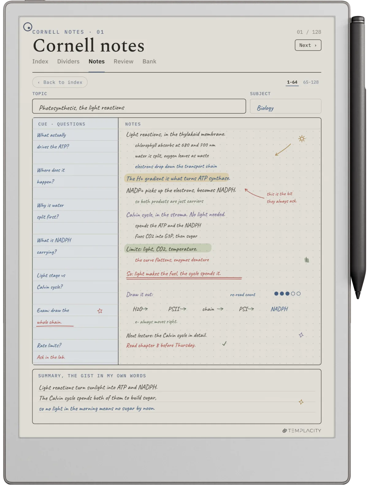
Six weeks later, revising that page takes about ninety seconds: cover, run the four cues, read the summary. If you would rather see finished pages than read one described, we have four Cornell notes examples written out, two of them photographed. Compare that with rereading two sides of continuous prose and hoping the important parts stand out.
The failure mode
The cue column is the part everyone skips
Watch how the method degrades in practice and it is always the same way. The layout survives, because the layout is printed on the page and takes no effort to keep. The cue column becomes a place for headings. The summary strip gets skipped entirely, or filled during the lecture with a sentence copied from the last slide.
What is left is a normal page of notes with a third of the width given away for nothing. That is worse than not using the method at all, because it looks like the method worked and it feels like the work was done.
What is left is a normal page of notes with a third of the width given away for nothing.The failure mode
The fix is small and slightly annoying: write questions, not keywords, and write them somewhere other than where you took the notes. A cue you can answer without thinking is not a cue. If the column reads like a table of contents, the page has quietly become a transcript again.
One test catches almost every bad cue. Read the cue on its own, with the right-hand field covered, and ask whether a classmate could use it to quiz you. “Photosynthesis” fails, because the only honest response is “what about it?”. “What does photosynthesis need as inputs, and what does it leave behind?” passes, because there is a right answer and you either have it or you do not. Cues that pass this test take about twice as long to write, which is most of the reason people stop writing them.
The other quiet failure is doing all three later steps in one sitting, immediately after the session, while the material is still fresh. It feels efficient and it is nearly worthless, because you are testing yourself on something you heard twenty minutes ago and will pass regardless. Leaving a gap of at least a few hours, ideally to the next day, is what makes the self-test tell you anything you did not already know.
Where it lives
Paper, an e-ink tablet, or an app
The method is indifferent to the surface, but the surfaces are not equally good at supporting it. The differences that matter are about the two after-the-fact passes, not about the writing itself.
| Paper notebookruled by hand | E-ink tablettemplate on file | Keyboard apptyped | |
|---|---|---|---|
| Ruling the page | Every page, by hand | Once, then reused | Once, then reused |
| Covering the notes to self-test | A sheet of paper | A hand or a sheet of paper | Awkward; the screen shows everything |
| Diagrams mid-sentence | Immediate | Immediate | Breaks the flow |
| Finding one page six weeks later | Flick and hope | Search or a linked index | Search |
| Distraction while writing | None | Near none | Everything else on the device |
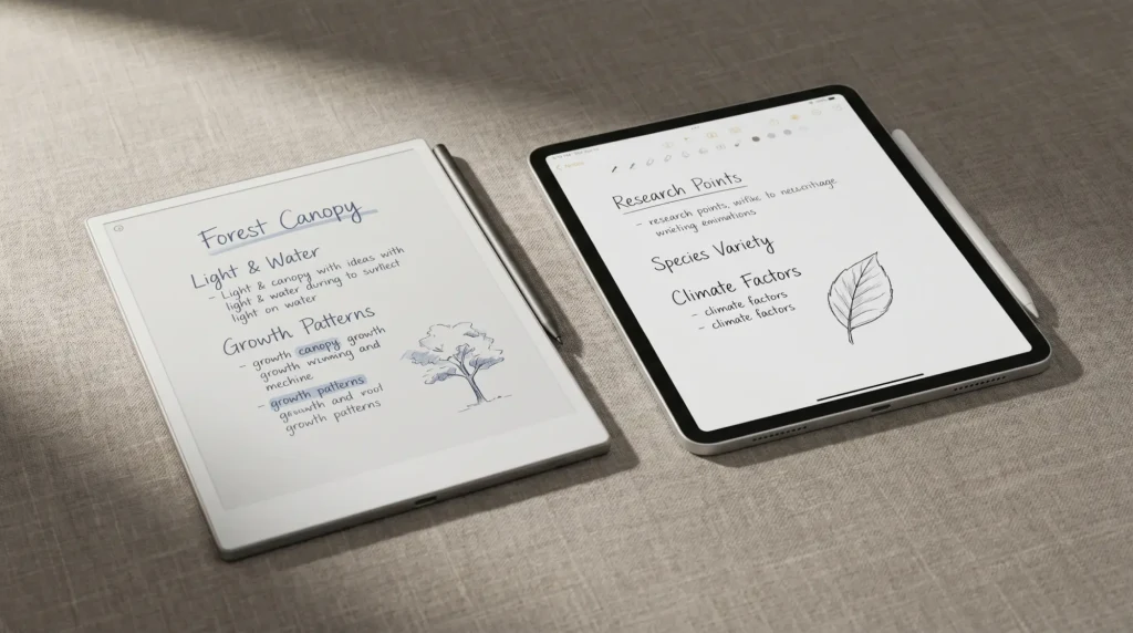
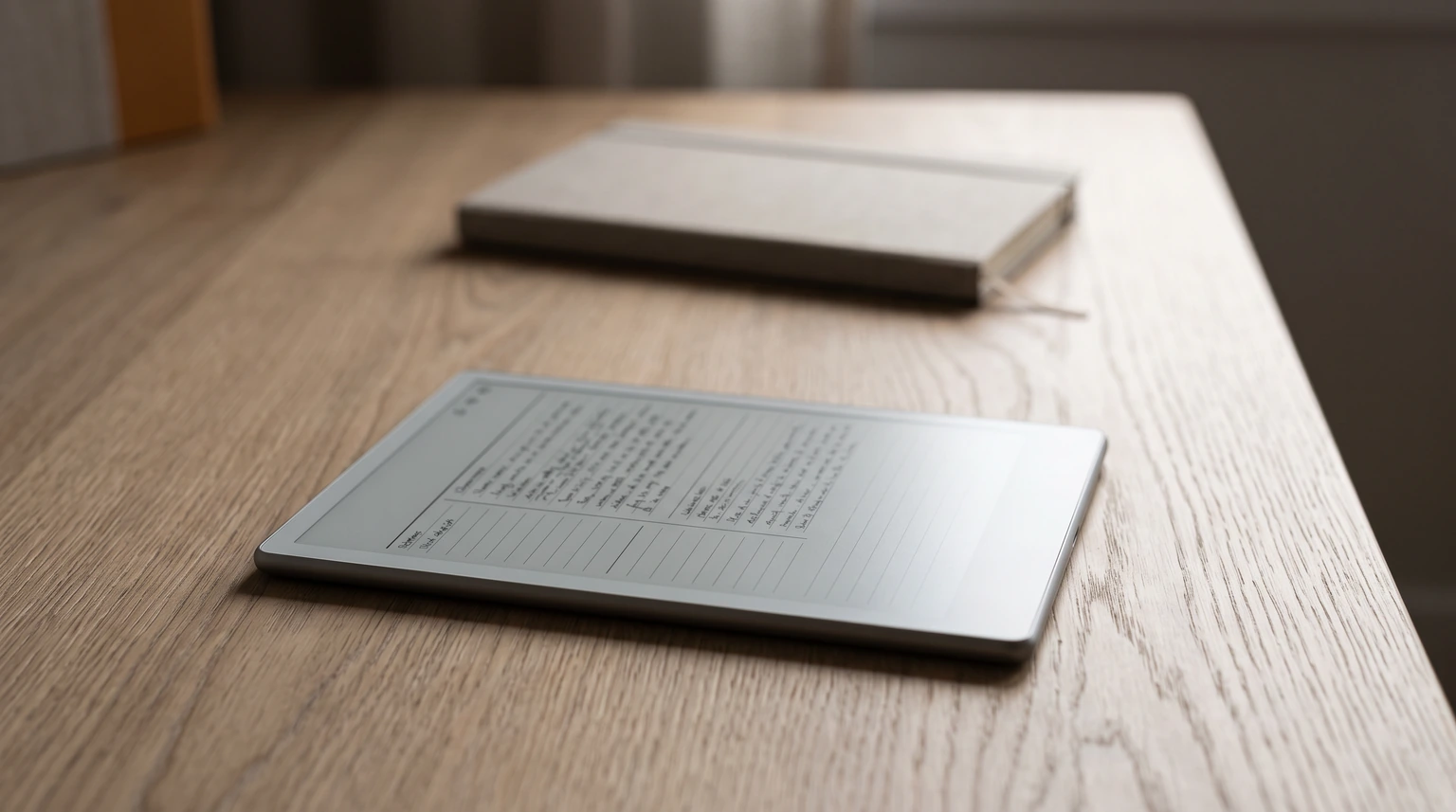
Paper wins the self-test outright, because covering half a page with another sheet is the most natural gesture in the world. Typed notes lose it, which is a real cost: the recite step is the one that does the learning, and an app that makes it awkward will quietly cost you the step. An e-ink tablet lands in between and buys back the ruling and the retrieval, which is why the method and the format get on well. If you are still choosing a surface, our note-taking app comparison covers the trade-offs more broadly.
Templates
What a Cornell notes template has to get right
Most free Cornell templates are a rectangle divided into three rectangles, and for paper that is genuinely all you need. Print it, done, and ours is free to download at Letter and A4 with a ruled and a blank version in the same file. On a tablet the bar is higher, because a file that cannot be navigated is a file you will abandon by week three.
Three things separate a template you keep from one you download and forget. The cue column has to be narrow enough that it cannot be used as a second notes field, or it will be. The summary strip has to be short, for the same reason. And the pages need to be reachable without scrolling through hundreds of them, which on a tablet means an index page with working links rather than a stack of identical sheets.
Labelling matters more than it sounds like it should. A stack of identical sheets gives you no way to tell which lecture a page belongs to six weeks later, and the search step in the table above only helps if there is something to search on. An index page with a numbered row per note fixes that at the point of writing: you name the page once, and the number takes you back to it.
It sits alongside the rest of the reMarkable template set, and if you are a student rather than a note-taker in general, the digital student planner covers the timetable side that Cornell pages deliberately do not. The full reMarkable bundle carries both.
Limits
Where Cornell notes are the wrong tool
The method assumes material that can be turned into questions and answers. That covers most lectures, most textbooks, and a surprising amount of meeting content. It does not cover everything. If you are the one delivering the lecture rather than sitting in it, our digital teacher planner guide covers planning the year around it.
Mathematics is the honest exception. A page of worked derivations does not decompose into cues, and forcing it produces a column of “how do you do step 4?” which teaches nothing. Practice problems do the job the cue column is trying to do, and they do it better.
Fast-moving discussion is the other one. If the room is generating decisions rather than explanations, you want a running list of decisions and owners, not a structure that asks you to leave a third of the page empty for later. The Cornell page rewards material you will be tested on, and a meeting is rarely that. Our wider reMarkable template library has shapes better suited to that kind of page.
Reading you are doing for pleasure or for a general sense of a field is the third case, and the one people talk themselves into most often. Cornell pages turn a book into an examinable object, which is exactly what you want for a set text and exactly what ruins a book you picked up because it looked interesting. If nobody is going to test you, the structure is asking you to pay a cost with no matching return. The cheaper habit for that kind of reading is a commonplace book: copy the handful of lines you want to keep, file each one under a subject, and leave the rest of the book alone.
None of this makes the method fragile. It makes it specific. Cornell pages are for material that has answers, that you will need later, and that you are willing to spend ten minutes on twice. When all three are true it is hard to beat, and when one of them is false there is usually a simpler page shape that costs you nothing to keep.
FAQ
Common questions, answered briefly
How do you use Cornell notes?
What are Cornell notes used for?
What goes in the cue column in Cornell notes?
Can you use Cornell notes digitally?
Who invented the Cornell note-taking system?
If yours isn’t above, drop the question in the comments and we’ll add it.
People also ask
Other questions, briefly answered
If you have been running Cornell pages for a while, we would like to know what your cue column looks like in practice, because that is the part where everyone’s version quietly diverges. Tell us in the comments.