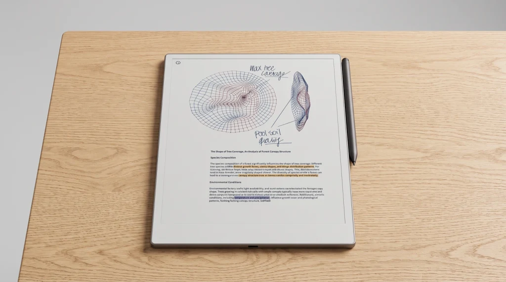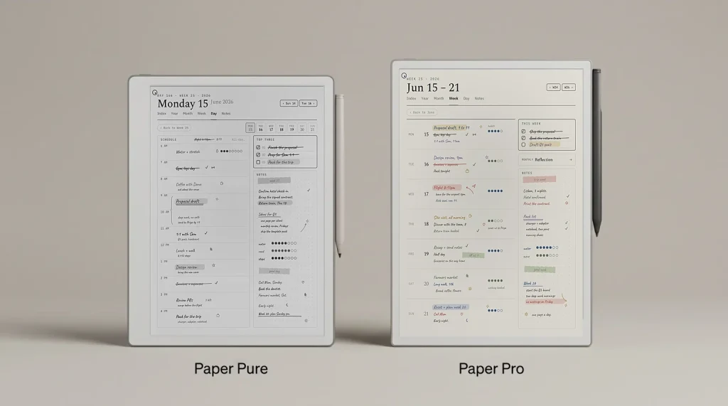
A Cornell notes example is more useful than another diagram of the layout, because the layout was never the hard part. Anyone can draw two lines. What separates a page that pays you back from a page that just looks tidy is the wording of eight or nine short entries, and the only way to show that is to put finished pages in front of you.
What to look at
What a finished Cornell notes example contains
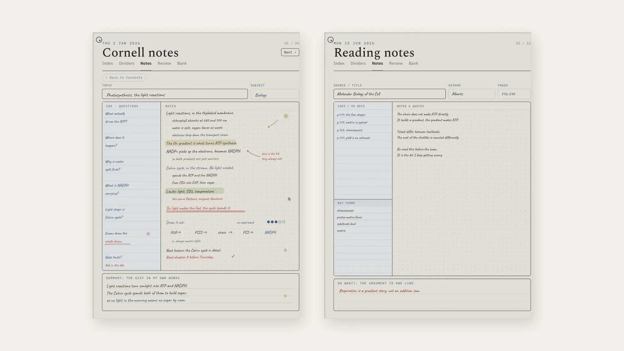
Three zones, filled at three different times. The wide field on the right is written during the session and is ordinary note-taking. The narrow cue column on the left is written afterwards, from the notes beside it. The strip along the bottom is written last, with the rest of the page covered.
That staggering is the whole method, and it is what you should be checking in the examples below. A page where all three zones were filled in one sitting looks identical to a page where they were not, which is exactly why the method fails quietly for so many people. The full walkthrough of Cornell notes covers the sequence and the reasons behind it; this page is only the finished article.
Example 1
A lecture: biology, the light reactions
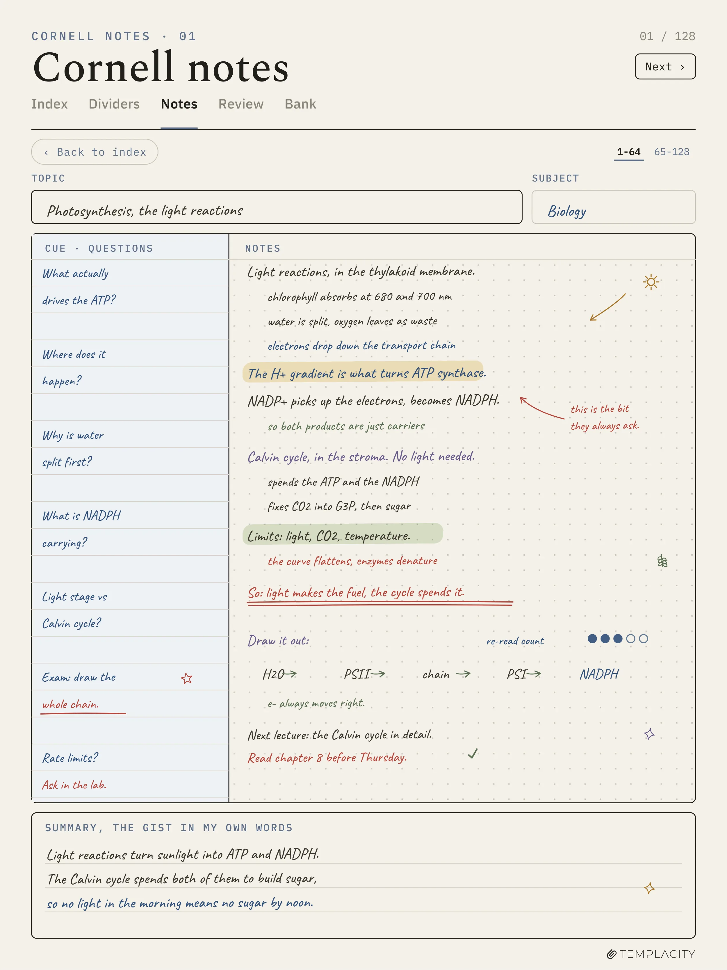
Read the right-hand field first and it is unremarkable: indented lines, a couple of highlights, an arrow, a chain drawn out along the bottom. That is what note-taking looks like when it is going well and it is not where the value is.
Now read the left column on its own. “What actually drives the ATP?” “Where does it happen?” “Why is water split first?” “What is NADPH carrying?” Every one is answerable, and every one has its answer sitting immediately to the right. Cover the notes and that column becomes a set of exam questions written by the one person who knows exactly which parts you found slippery.
Two details are worth stealing. “Exam: draw the whole chain” is underlined in the cue column, which is a note to the reviser rather than a question, and it is the sort of thing that only occurs to you on the second pass. “Ask in the lab” sits at the bottom of the same column, which is an honest admission that one cue has no answer yet. A cue column with a gap in it is doing its job; a cue column with no gaps usually means the questions were too easy.
The summary reads: light reactions turn sunlight into ATP and NADPH, the Calvin cycle spends both of them to build sugar, so no light in the morning means no sugar by noon. Three lines, causal, and the last clause is a consequence rather than a restatement. That final move is the tell that it was written from memory.
Example 2
A textbook chapter: reading rather than listening
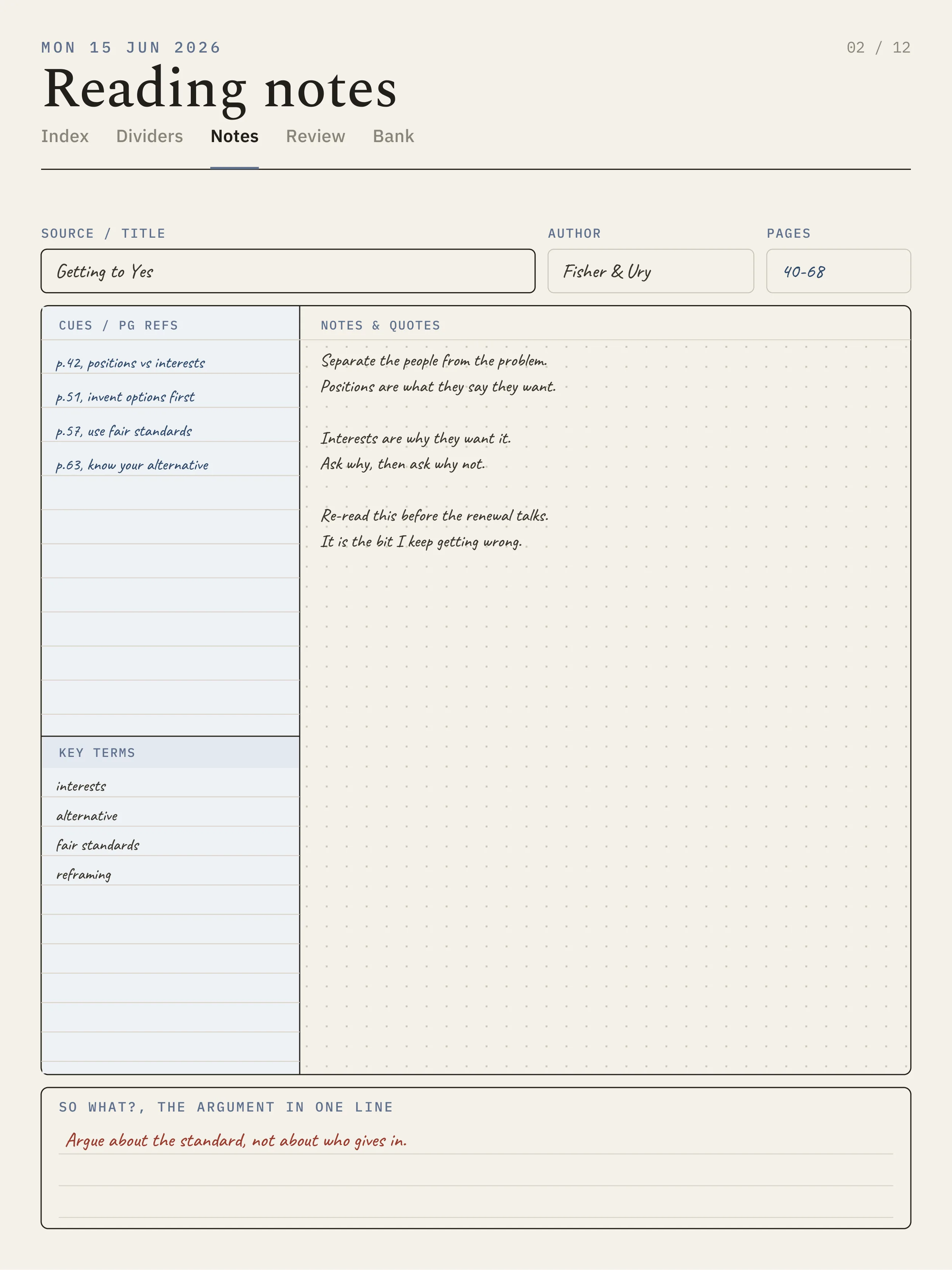
A Cornell notes example for reading changes what the cue column is for. In a lecture you cannot pause, so the cues get written later. With a book you can, so the left column fills with page references instead: p.514 the four stages, p.519 matrix versus cytosol, p.523 chemiosmosis, p.531 yield is an estimate. Each one is a pointer back into the source, which is the thing you will actually want at 11pm three weeks later.
The notes side is shorter than the lecture page and it should be. Two lines on what the chain does, two on why the totals disagree between textbooks, and two that are not notes at all: “re-read this before the exam”, “it is the bit I keep getting wrong”. Notes to yourself belong on the page. They are the highest-value lines on it and they are the first thing people leave out.
The strip at the foot is labelled “so what?, the argument in one line” rather than “summary”, and the entry reads: respiration is a gradient story, not an addition sum. For reading, that framing is better than a summary. A chapter has a thesis, and if you cannot state it in one sentence you have taken notes on a chapter you did not follow.
A cue column with a gap in it is doing its job; a cue column with no gaps usually means the questions were too easy.Example 1
Example 3
A work meeting: a quarterly planning session
Cornell pages are sold as a student tool and they are better than that. A meeting has the same shape as a lecture: someone talks, decisions arrive faster than you can process them, and a week later you need the reasoning rather than the transcript. Written out, a page from a quarterly planning session looks like this.
| Cue, written after | Notes, written live |
|---|---|
| Why did onboarding move ahead of billing? | Support ticket volume, not revenue. Two thirds of tickets are first-week. Billing slips to Q4. |
| Who owns the migration, and from when? | Priya, from the 14th. Currently unstaffed until then, nobody said so out loud. |
| What did we agree not to do? | No second region this quarter. Revisit only if latency complaints double. |
| What number decides it? | First-week tickets per hundred signups. Nobody has this yet. |
| What is the thing I disagreed with? | Billing slipping. Did not say so in the room. Raise it with Tom before Friday. |
Summary strip: onboarding wins the quarter on ticket volume rather than revenue, billing waits for Q4, and the whole plan rests on a first-week ticket rate nobody is measuring yet.
Notice the last cue. “What is the thing I disagreed with?” is not a comprehension question, and in a meeting it is the most valuable line on the page, because the disagreement you did not voice is the one you will forget by Friday and resent by December. A work page earns its keep through cues like that rather than through recall.
Example 4
A language class: vocabulary and one grammar point
Language is the case where the standard advice breaks, and it is worth showing because so many people try Cornell pages for a language, find they do not fit, and conclude the method is overrated. The cue column stops being questions and becomes the prompt side of a flashcard, which is a different job that happens to use the same column.
| Cue, the prompt side | Notes, the answer side |
|---|---|
| soler + infinitive | To usually do something. Solia caminar = I used to walk. Almost always imperfect. |
| Imperfect or preterite? | Imperfect for the background and the habit, preterite for the single completed event. |
| The three irregulars | ir, ser, ver. Only three in the whole tense, which is the good news. |
| Why “mientras” matters | It signals two things happening at once, so both verbs go imperfect. |
| My repeated mistake | Using preterite for weather. It was raining is background, so imperfect. |
Summary strip: the imperfect is for the scenery and the habit, the preterite is for the event, and my error is always the weather.
The wide cue column is the one layout change this Cornell notes example asks for. Vocabulary prompts run longer than questions do, and a column sized for four words will push everything onto a second line. If you are running a language on paper, rule the vertical line closer to the middle than the classic one third.
The test
One check that separates a good cue from a bad one
Read a cue on its own, with the notes covered, and ask whether a classmate could use it to quiz you. “Photosynthesis” fails, because the only honest reply is “what about it?”. “What is NADPH carrying?” passes, because there is a right answer and you either have it or you do not.
Every cue in all four examples above passes that test, and that is the only thing they have in common. The subjects differ, the column widths differ, and in the language example the cues are not even questions. What holds is that the left column can be used without the right one. When that stops being true the page has quietly turned back into ordinary notes, which is the failure mode the pillar guide goes through in detail.
If you want to try one of these shapes, the blank page is free: our Cornell notes template comes as a print-ready PDF and an editable .docx at Letter and A4, with a ruled and a blank version in the same file. Print the ruled one for a lecture and the blank one for anything with a diagram in it.
If you are building a study system rather than filling single pages, the Zettelkasten method is the natural next step: Cornell pages capture and reduce a session, and a zettelkasten is where the reduced version goes to meet notes from everything else you have read. The rest of the shapes live in the reMarkable template library.
FAQ
Common questions, answered briefly
What should a Cornell notes example look like when it is done?
How many cues should one page have?
Can you use Cornell notes for something other than studying?
What goes in the summary if the session had no conclusion?
Do Cornell notes work for maths?
If yours isn’t above, drop the question in the comments and we’ll add it.
People also ask
Other questions, briefly answered
We would rather see your pages than write more of our own. If you have a Cornell notes example that earned its keep, particularly for a subject nobody writes examples for, post the cue column in the comments. The cues are the part everyone gets differently and the part worth arguing about.