The methods
Three ways to build a gantt chart in Google Sheets
There are three genuine approaches, and choosing between them decides how much of your life you spend maintaining the thing. The stacked bar chart plots each task as a start offset plus a duration and hides the offset series so only the duration shows. The conditional-formatting grid lays dates across the top and colours the cells that fall inside each task’s window. The third uses SPARKLINE to draw a tiny bar inside a single cell per row.
Search results are dominated by the first, and it is worth understanding why: it produces the picture people recognise, in a screenshot, immediately. That is a good reason to write a tutorial about it and a poor reason to run a project on it.
The trap
Why the stacked bar chart is the wrong instrument
A chart in a spreadsheet is a rendering of a specified range. That is fine for data that grows predictably and poor for a plan, because a plan changes shape rather than merely changing values. Add three tasks and the chart is reading a range that no longer covers them. Reorder the phases and the series order stops matching. Change a date format and the axis rethinks itself.
None of that is a bug. It is a chart doing what charts do, applied to the one kind of data that will not sit still. The result is a gantt that is accurate on the day you build it and quietly wrong three weeks later, which is worse than no gantt at all because you are still looking at it in meetings.
The grid method passes that test because nothing is rendering a range. Every cell is asking itself a question about its own column and its own row, and a cell that has been added answers it just as readily as one that was always there.
The build
Building the grid with one custom formula
The whole gantt is three columns, a row of dates and a single conditional formatting rule. Google documents that “cells, rows, or columns can be formatted to change text or background color if they meet certain conditions”, and that the advanced version lives under Format, then Conditional formatting, then choosing “Custom formula is”.
-
1
Three columns and nothing else
Column A the task, column B the start date, column C the end date. Real dates, not text. Everything downstream depends on these being dates the sheet can compare.
-
2
One cell drives the calendar
Put the first date in D1. In E1 write
=D1+1and drag it across. Now the entire header is computed from one cell, and moving the project a fortnight is one edit. -
3
Select the grid, add one rule
Select D2 to the last column and last row. Format, Conditional formatting, Custom formula is, then
=AND(D$1>=$B2, D$1<=$C2)with a fill colour. That is the gantt. -
4
Read the dollar signs, because they are the whole trick
D$1locks the row so every cell looks up to its own column’s date.$B2and$C2lock the column so every cell looks across to its own row’s dates. Get these wrong and the grid colours in stripes.
One constraint from the same documentation is worth knowing before you organise the file: “formulas can only reference the same sheet”, and referencing another sheet needs the INDIRECT function. So keep the task table and the grid on one tab rather than splitting them for tidiness.
What breaks
The column that runs out
The grid has exactly one serious failure mode and it is silent, which is the kind worth naming. Your date header covers some number of columns. A task that ends after the last of them is still in the table, still has valid dates, and simply does not appear in the picture. Nothing errors. Nothing turns red. The plan looks shorter than it is.
A task that runs past the last column does not error, it disappears, and a plan that looks shorter than it is will be read as good news.
Two habits remove it. Build the header well past where you think the project ends, since empty columns cost nothing. And put a check cell somewhere visible that compares the largest end date against the last header date, so the sheet tells you rather than waiting to be noticed. This is the same shape as the fixed-range problem that quietly undercounts a growing log, which our Google Sheets expense tracker guide covers in its own context.
Progress
Progress bars without building a chart
Once the timeline works, the next request is always how far along each task is. You do not need a second chart for it. Google’s SPARKLINE function “creates a miniature chart contained within a single cell”, taking the form SPARKLINE(data, [options]), and its charttype option supports line, bar, column and winloss.
A progress column is therefore one formula per row against a percentage you type, drawn as a bar inside the cell. It lives in the table rather than floating above it, it sorts and filters with the rows, and it never needs its range repaired. That combination is the argument for it over a real chart, and it applies to almost every in-table visual a plan needs.
The limit
Dependencies, and what a spreadsheet will not do
Here is the honest boundary. Real project software knows that task C follows task B, so moving B moves C. A spreadsheet does not know that unless you write it, and you can write it: make the start date of a dependent task a formula pointing at the end date of its predecessor rather than a typed date.
That works and it goes wrong in a specific way. A chain of formula-driven dates is invisible on the surface, so somebody types a date over one link, the chain silently breaks at that point, and everything downstream stops moving. If you build dependencies, tint the formula-driven cells a different colour so a typed override is obvious on sight.
Beyond a few dozen tasks with real dependencies between them, the spreadsheet is being asked to be something it is not, and the honest answer is to move rather than to keep patching. Below that, it is genuinely better than most project tools, because it is free, it opens instantly, and it can be reshaped by whoever needs it. Google states that anyone with a Google Account can create in Sheets, which is the reason a plan in a spreadsheet is one nobody has to be invited to read.
Keeping it
What makes one survive past week three
Plans die of maintenance cost rather than of design. Three choices carry most of it. Keep dates as dates, because one text date breaks every comparison silently. Keep the whole thing on one tab, since the conditional formatting cannot reach across sheets without INDIRECT anyway. And drive everything you can from a single cell, so the most common edit, moving the project, is one keystroke rather than a reformat.
A gantt chart covers the when. If you also need the why, the scope and who approves a change, our project plan template guide lays out the eight sections that sit above the schedule.
If your plan is really a recurring weekly rhythm rather than a project with a finish line, a schedule is the better shape, and our Google Sheets weekly schedule template guide covers that. If it needs a budget alongside it, the Google Sheets budget template guide covers the money side. And if the work has no finish line at all, only a queue of things at different stages, a timeline is the wrong instrument entirely: our content calendar template guide covers why a pipeline view beats a date grid there.
Build the grid, compute the header, and put a check cell where you will see it. A gantt you can trust in month three is worth several that photographed better in week one. Tell us in the comments whether you have ever had a task vanish off the end of the calendar, because it happens to almost everyone once and almost nobody twice.
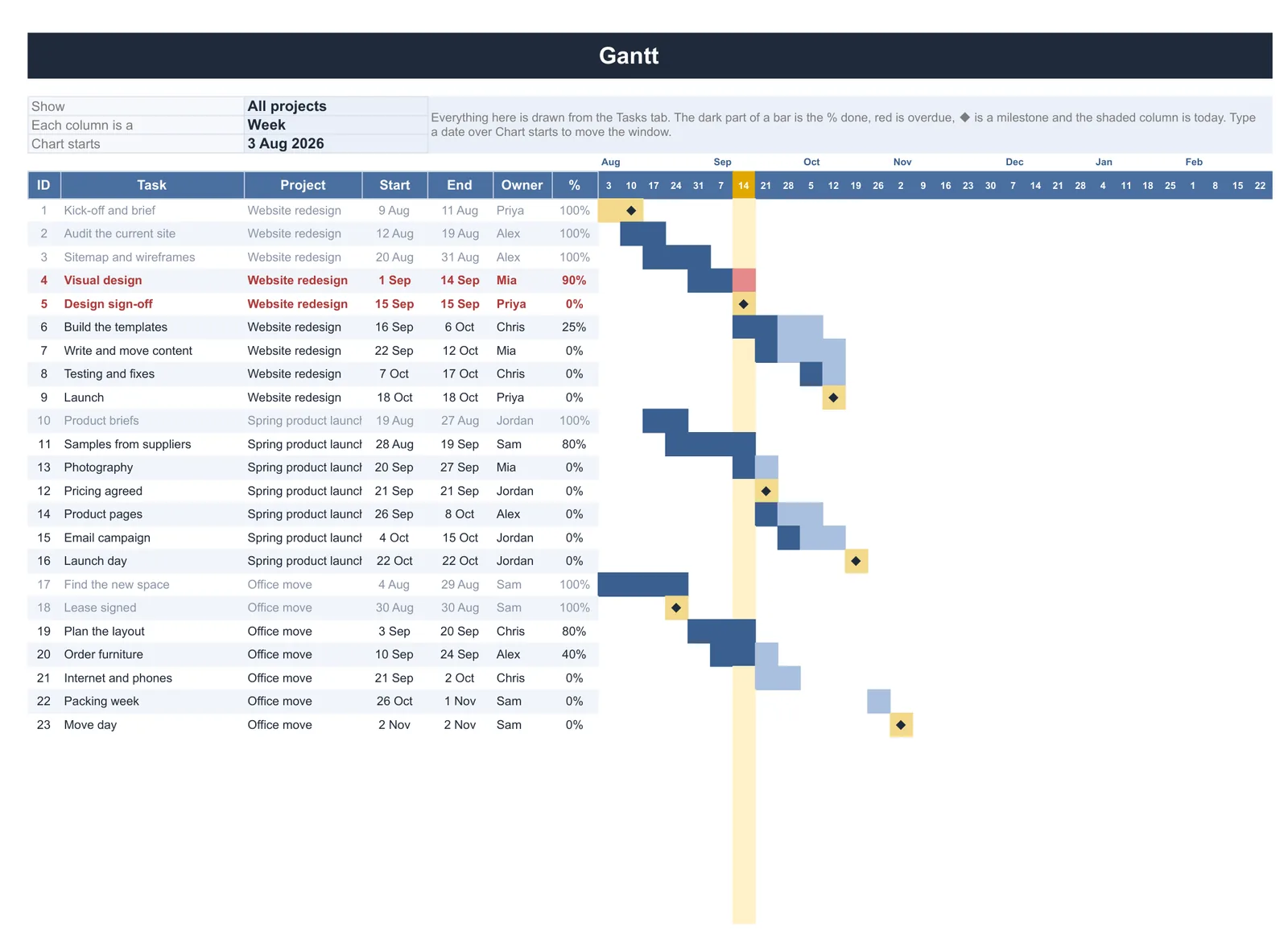
If you would rather not build the conditional formatting yourself, our Project Tracker with Gantt Chart ($39, Google Sheets and Excel) is the finished version: type your tasks once and the Gantt chart draws itself, with bars shaded by percent done, late work in red, milestones and a today line, for one project or all of them.
FAQ
Common questions, answered briefly
What is the formula for a gantt grid in Google Sheets?
=AND(D$1>=$B2, D$1<=$C2). The dollar signs are the trick: D$1 locks the row so each cell reads its own column’s date, $B2 and $C2 lock the column so each cell reads its own row’s dates.Why did a task disappear from my gantt chart?
Should I use a stacked bar chart instead?
Can I put a progress bar in the same table?
People also ask