The pattern
Why the third ADHD planner fails like the first two
There is a recognisable arc to buying an ADHD planner. The first week is meticulous. The second is partial. Somewhere in the third a day gets missed, then a week, and the book becomes a small object of guilt that is easier not to open. The usual conclusion is that the problem was you.
It is worth noticing how consistent that arc is across people who otherwise share nothing, and how consistent the products are too. The most upvoted community thread on this subject anywhere is a post in a large ADHD forum whose title is a complaint that the planners marketed for ADHD do not work. It currently sits at number three on Google for this search, above most of the products it is complaining about.
When a category’s own customers rank higher than the category, the category has a design problem.
What follows is not a roundup. There are several already on the first page of this search and they mostly agree with each other, which is usually a sign that everyone is describing covers. This is about the page itself: which layout decisions decide whether a planner survives a bad week, where those decisions come from, and which ones the products sold under this label reliably get wrong. The criteria are not ours. They come from the organisation that exists for adults with ADHD, and they are specific enough to check with your own eyes before you spend anything.
The diagnosis
What ADDA actually says about it
The Attention Deficit Disorder Association, which describes itself as “the only organization dedicated exclusively to helping adults with ADHD”, is blunter about this than the shops are. Their assessment of the category is that “some planners marketed for ADHD often fall short because they focus more on aesthetics than functionality”.
That sentence is doing a lot of work. It says the market has optimised for the thing you can photograph, which is the cover, the colour palette and the sticker sheet, and under-invested in the thing that decides whether the book survives March, which is the layout of a single page.
On the hourly grid specifically, ADDA’s point is that “time blindness can make it difficult for things to go exactly as scheduled”. A page ruled into hourly rows is a page that starts recording failure at about ten in the morning.
The criteria
The seven things ADDA says a page should do
Their list is refreshingly mechanical. Every item is a property of the paper rather than a property of the person using it, which makes it something you can check before buying instead of after.
A brain-dump area.
Somewhere to put a thought that arrives mid-task without leaving the task. Without one, the only available storage is the task you are currently doing.
Broad time blocks, not hourly rows.
Morning, afternoon, evening. Three bands cannot be fallen behind in the way twelve rows can, and they still order the day.
Undated or flexible pages.
ADDA’s stated reason is reducing the guilt of missed days. A dated page you skipped is a permanent record; an undated one is just the next page.
Low visual clutter.
The decoration that sells the planner competes with the content for the same attention. Clean layouts, in their phrasing.
A way to carry tasks forward without rewriting them.
Rewriting yesterday’s undone list is a tax charged at the exact moment motivation is lowest, and it is the step where most systems are abandoned.
Priority markers, such as a top three.
A structural cap on how much the day is allowed to contain. A list of nineteen items communicates nothing about which one matters.
Something to tick off.
Checkboxes and similar hooks, in ADDA’s list. Small, frequent, visible progress, built into the page rather than depending on the size of the task.
Run that list against the last planner you abandoned. Most sold as ADHD planners satisfy the seventh, some the first, and very few the third and fifth, which are the two that decide whether the thing survives a bad week. Running that check on a book nobody markets for ADHD is instructive: the Panda Planner clears five of the seven, including the undated one most of the branded shelf misses.
The grid
The hourly grid is the single worst default
If you change one thing, change this one. The hourly grid is the default layout of nearly every daily page ever printed, and it encodes an assumption that estimating and holding to clock time is easy.
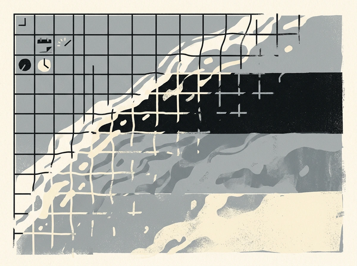
Consider what the two layouts do with the same slipped morning. On an hourly page, a task that overran by ninety minutes has displaced three labelled rows, and each of those rows now shows a specific thing that did not happen at a specific time. On a three-band page, the same overrun means the morning band is fuller than expected and the afternoon has less room. One of those is information. The other is a scoreboard.
One of those is information. The other is a scoreboard.The grid
The objection is that broad blocks are too loose to schedule against, and for genuinely fixed commitments that is fair. The usual answer is that appointments with a real clock time belong in a calendar with an alarm, and the planner holds the work that is yours to place. Mixing the two is what forces the hourly grid on a page that does not need it.
Carry-forward
The undone list is where systems actually die
ADDA’s fifth criterion is the least discussed and, on the evidence of how people describe abandoning planners, the most load-bearing. A task that was not done yesterday has to get to today somehow.
If the mechanism is “write it again”, then the cost of a bad day is paid at the start of the next one, in the form of copying out a list of things you already feel bad about. Two or three consecutive bad days make that opening cost large enough that not opening the book is the rational move, and at that point the system has ended even though nothing announced it.
Layouts that survive this have somewhere the undone can sit without being recopied: a running list beside the day rather than inside it, a weekly spread the daily pages hang off, or in a digital file, a page you move rather than duplicate. The test is simple. Ask what a three-day gap costs you in writing. If the answer is more than a minute, the layout will not survive a real year. This is also the one criterion a PDF structurally cannot satisfy, which is worth knowing before buying one: what a digital planner does and does not fix.
The weekly-spread version is worth spelling out because it is the cheapest fix and almost nobody frames it this way. Tasks live on the week, dated only when you decide to do them. The daily page becomes a view onto that week rather than a container, so a skipped day moves nothing and loses nothing; the task simply never got a day assigned. The cost of three bad days drops to zero, because there was never anything to copy forward in the first place.
This is also why so many people end up back at a plain list after abandoning several planners. A list has no dates to fall behind on. What it lacks is the second half of ADDA’s criteria, the priority cap and the sense of a day having a shape, which is why the answer is usually a weekly page rather than either extreme. Software solves the carry-forward half outright and brings two problems of its own, set out in the ADHD planner app checklist.
Paper or screen
Does an ADHD planner work better on paper or a tablet
Both can satisfy the seven criteria and each one makes a different pair of them easy.
| Paperbound book | TabletPDF or app | |
|---|---|---|
| Brain dump always available | Only if you carry it | Already with you |
| Carrying tasks forward | Rewrite by hand | Move or copy a block |
| Skipping days guilt-free | Visible gap in a bound book | Nothing on screen shows the gap |
| Low visual clutter | Whatever you drew | Depends entirely on the file |
| Friction to open it | Flip it open | A device with everything else on it |
| Completion you can feel | Physical tick | Tap, if the file has boxes |
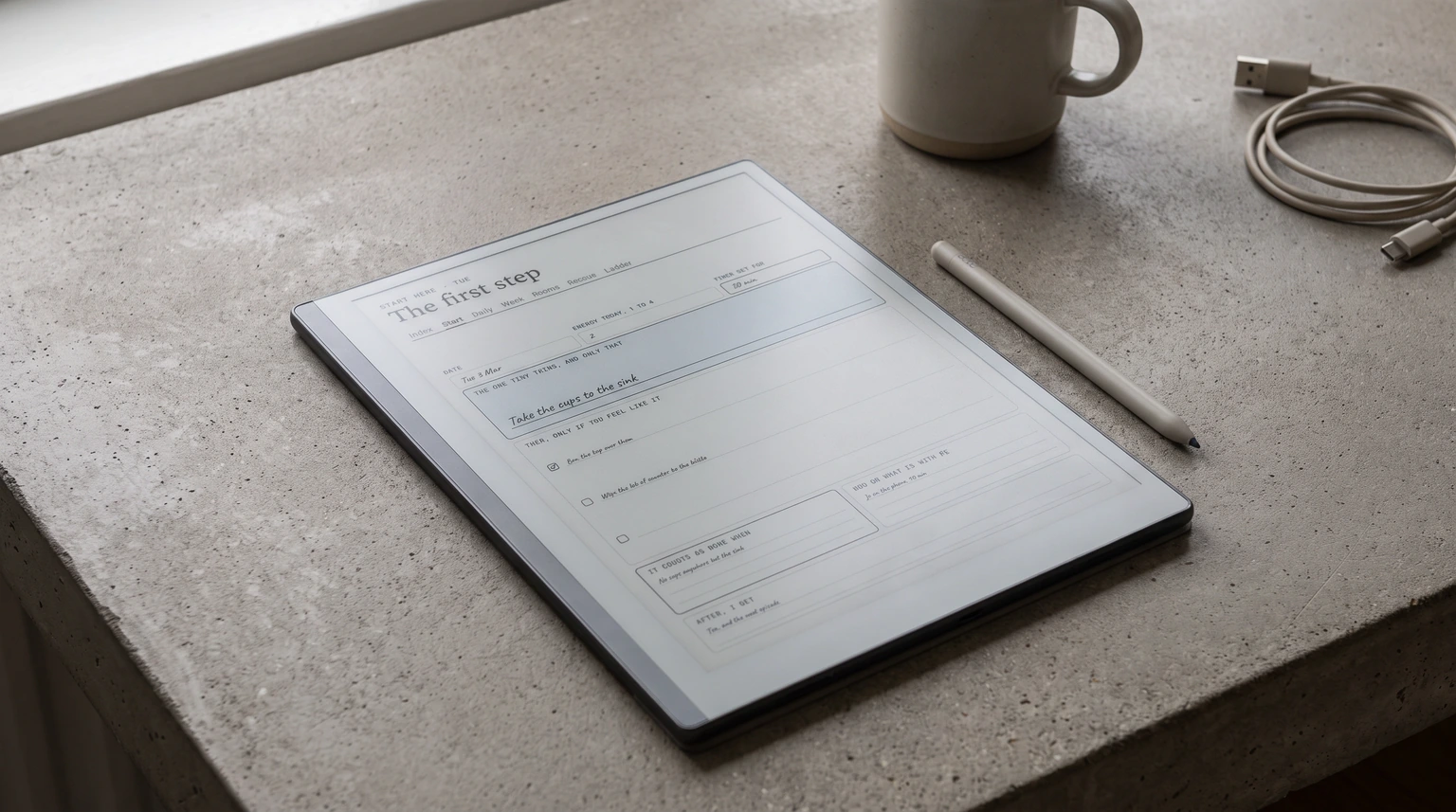
The last row of that table is the one people underrate. A general-purpose tablet puts the planner one swipe away from every other thing competing for the same attention, which is a real cost and the reason distraction-free e-ink devices have the following they do. If you are weighing that trade-off, our e-ink planner guide covers what that hardware does and does not solve, and the note-taking app comparison covers the software side.
The test
How to test a layout before you commit a year to it
The expensive part of choosing wrong is not the money. It is that you find out in March, having built two months of habit around a page that was never going to hold, and the conclusion you draw is about yourself rather than about the page.
There is a cheaper way to find out, and it takes about a week. Draw the layout you are considering onto plain paper, badly, once a day. You are not testing whether you like it. You are testing three specific things, and a hand-drawn version answers all three.
First, does the page have room for the way your day actually goes wrong? Not the ideal Tuesday, the real one, where the first task takes two hours and something arrives at four in the afternoon. If the layout has no space for that shape of day, no amount of discipline will make it fit.
Second, skip a day on purpose, part way through the week. This is the test almost nobody runs and it is the one that predicts abandonment. Come back on day three and notice what the page does. If your first move is to rewrite yesterday, or if the gap sits there as a visible reproach, you have found the failure before it cost you anything.
Third, count what you wrote that was not a task. Thoughts, half-ideas, the thing you remembered while doing something else. If they ended up crammed in a margin or lost entirely, the layout needs a brain-dump area that it does not currently have, and adding one later is much harder in a bound book than in a file.
A week of ugly hand-drawn pages will tell you more than any review, including this one, because it tests the layout against your week rather than against someone else’s. The same three tests apply to a household routine, where the failing grid is a week of days rather than a day of hours; that version is here.
Where we stand
What we make, and why we are not recommending it here
We build digital planners, so the honest thing is to say where ours sit against the list above rather than to end this with a product.
Our planners are dated on purpose. Every page carries its real date, which is what makes a year navigable and what most of our readers ask for. That is a direct conflict with ADDA’s third criterion, and it is not a conflict we can style our way out of: a dated page you skipped shows that you skipped it, which is exactly the effect they say to design away.
So we are not going to tell you our current planners are the ADHD answer. They satisfy the brain-dump, clutter, priority and completion criteria, and the dated line fails the undated one by design. There is now one exception and it is a narrow one. Our ADHD Cleaning Planner is undated, and it stays that way, because a cleaning book that expires in December is a worse object than one that starts on whatever day you open it. It answers a smaller question than this page does: it covers the house, not the whole day. If the undated criterion is what has broken every planner you have tried and you want a full day planner, buy an undated one from someone who makes them, or print the layout yourself. Our work planner breakdown shows the layout logic we use if you want to judge the rest of it for yourself.
We would rather lose the sale than have you abandon a fourth planner and conclude, again, that the problem was you. One case does invert the advice above: a school timetable is imposed rather than chosen, so a student planner wants printed dates rather than undated pages.
FAQ
Common questions, answered briefly
What should I look for in an ADHD planner?
Why do planners never work for me?
Is an undated planner better than a dated one for ADHD?
Do digital or paper planners work better for ADHD?
Are ADHD planners just normal planners with different marketing?
If yours isn’t above, drop the question in the comments and we’ll add it.
People also ask
Other questions, briefly answered
If you have a layout that has actually lasted, we would like to hear which of the seven it satisfies and which one you gave up on, because the trade-off people make is more interesting than the list. Tell us in the comments.