For the broader buyer’s guide on running a Kindle planner on the Scribe (device check, file-format anatomy, setup paths, free vs paid tradeoffs, and the reMarkable comparison), see the pillar.
Premise
What a Kindle Scribe Colorsoft planner actually changes
A Kindle Scribe Colorsoft planner is not just a mono Scribe planner with colour added. The Colorsoft’s Kaleido 3 panel renders mono content at 300 PPI and colour content at 150 PPI, which means colour is visually softer and pre-printed colour artwork loses some sharpness. The practical implication: colour belongs in places where it carries genuine information, not as a decorative overlay on a planner that would have worked at the same legibility on a cheaper mono Scribe.
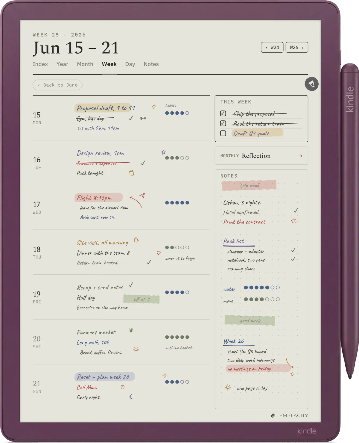
The Colorsoft writes in ten pen colours and five highlighter colours, and those are the design constraint a Colorsoft planner is built around. They apply to your annotation, not to the template’s printed lines, so the planner needs to leave a colour-eligible zone, a key, or a colour-encoded structure that gives them something useful to do. Without that, a Colorsoft planner becomes a mono planner you happen to be holding a colour stylus over.
Picks
The five Kindle Scribe Colorsoft planner styles that earn it
These are the five planner styles where the Colorsoft’s colour layer genuinely changes the workflow. None of them are gimmicks; each uses one specific affordance of the six-colour highlighter set. If the planner you want is not on this list, the mono Scribe is likely the better tool for the job.
| Planner style | What colour does | Earns the colour panel |
|---|---|---|
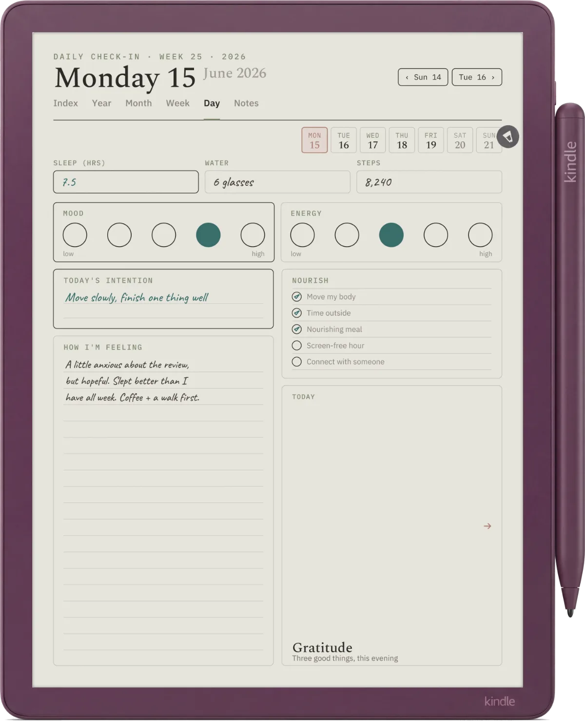
| Highlighter-coded weekly | Each day pre-zoned for category tags (work, personal, health, etc.) you fill with a fixed colour key | Yes |
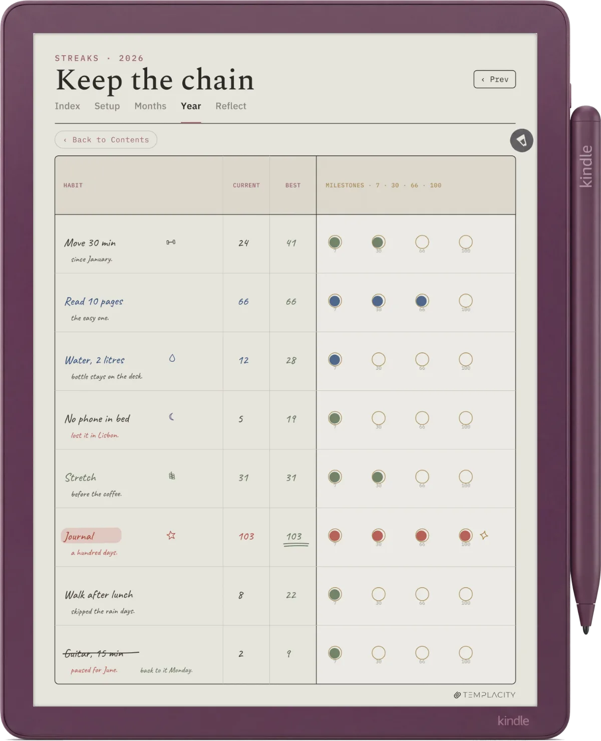
| Colour-block habit tracker | Habit rows where success and miss are encoded by colour, not by checkmarks | Yes |
| Language vocab planner | Nouns, verbs, and adjectives colour-keyed for grammar review at a glance | Yes |
| Project planner with swim lanes | Each project gets its own pen colour; cross-project view shows load by hue | Yes |
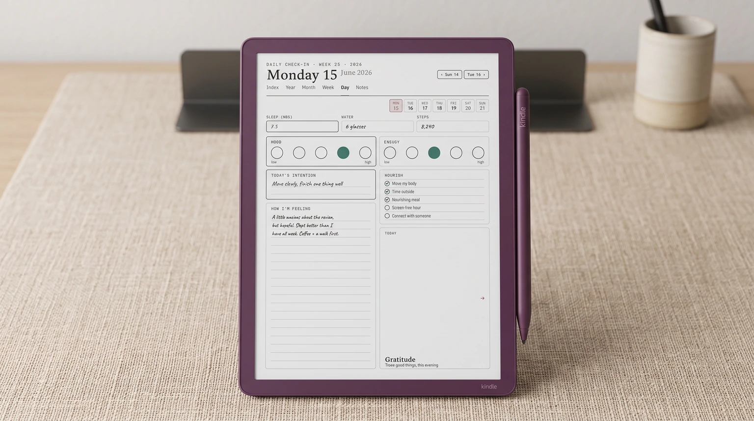
| Mood-tracking daily | Mood field with a fixed colour key mapped to feeling categories; the page is a record of the week’s emotional shape | Yes |
| Plain weekly grid | Decoration only; the structure is the same as a mono planner | No, mono Scribe handles this |
| Meeting-notes log | Free-form notes; colour is incidental | No, mono Scribe handles this |
Read the table top to bottom. The five planner styles that earn the colour panel all share one trait: the colour is structural, not cosmetic. The highlighter passes are doing legible category-work that a mono planner would need text labels for. If you can sketch a planner where removing the colour breaks the system, that planner belongs on the Colorsoft. If the planner reads fine in pure black, the Colorsoft is overspend for the role.
Format
Format and install: same path as the mono Scribe
A Kindle Scribe Colorsoft planner ships as a PDF, the same way mono Scribe templates do. The Colorsoft’s 11-inch panel is 1980 x 2640 at 300 PPI, and the original 10.2-inch Scribe is 1860 x 2480, which is the same 3:4 shape, so a file cut for either one fills the screen: the older size simply scales up by about 6.5 percent per axis, with no padding and no cropping. For most weekly and habit-tracker layouts the older size is fine and saves the design work. For dense planners where hairlines matter, draw at 1980 x 2640.
Install path: drop the PDF onto Send to Kindle from a laptop or phone, the planner appears on the device under Notebooks, write directly on the page with the Basic Pen. Highlighter strokes save with the page and sync to the Kindle app for export. For deeper template-design notes, our Kindle Scribe Colorsoft templates piece covers the broader design constraints; this one stays focused on the planner picks.
If you can sketch a planner where removing the colour breaks the system, that planner belongs on the Colorsoft. If it reads fine in pure black, the Colorsoft is overspend for the role.Picks section
Pitfalls
Common Kindle Scribe Colorsoft planner mistakes
The most common error is designing a Colorsoft planner around colour as a decoration layer. Pink section headers, blue task boxes, green checkmark grids. These read fine on screen but the planner does not actually use colour for anything, which means the Colorsoft layer is paying for visual flourish rather than function. The same planner on a mono Scribe would have served identically for less money.
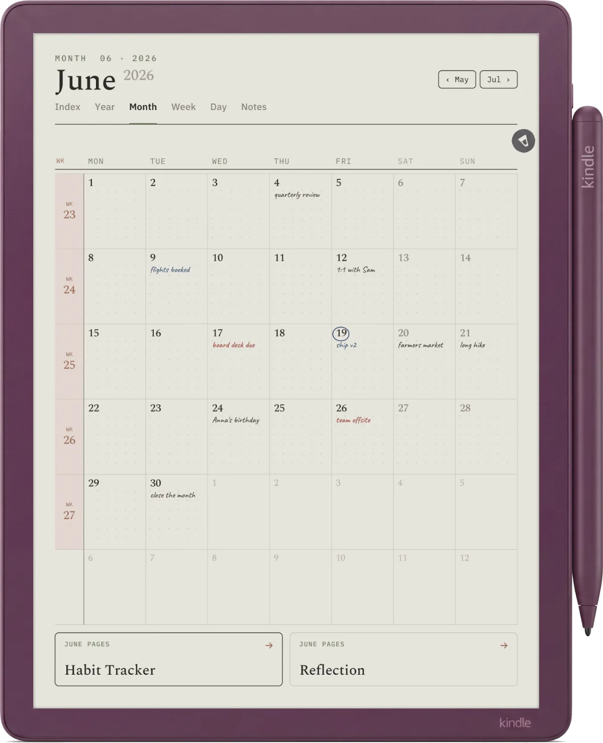
The second error is ignoring the 150 PPI ceiling on colour content. Templates with finely detailed colour artwork (gradients, photographic textures, dense colour patterns) lose definition on the Colorsoft because the colour layer cannot resolve them. The discipline is to keep colour use to flat blocks, lines, and single-shade fills where the panel’s strengths land cleanly. The third error is forgetting that highlighter strokes are user-applied, not pre-printed. If your planner depends on pre-printed colour zones, design those at 150 PPI and keep them simple.
If you have built a Kindle Scribe Colorsoft planner that genuinely uses the colour panel, share it in the comments. The design discipline is still being figured out across the Colorsoft community, and concrete examples help calibrate what actually earns the upgrade.
FAQ
Common questions, answered briefly
Is a Kindle Scribe Colorsoft planner worth it over a mono Scribe planner?
What size should a Kindle Scribe Colorsoft planner be?
How do I install a Kindle Scribe Colorsoft planner PDF?
Which colour highlighters does the Kindle Scribe Colorsoft support?
Are mono Scribe planners compatible with the Colorsoft?
If yours isn’t above, drop the question in the comments and we’ll fold it in next refresh.
People also ask