Kindle Scribe OneNote Integration: Ultimate Sync Guide
Kindle Scribe OneNote Integration: Ultimate Sync Guide Productivity & Tech Mastering Your Kindle Scribe OneNote Integration Workflow For professionals who live in the Microsoft ecosystem,
You have upgraded to the 11.8-inch Canvas Color display, but your digital desk is still a mess. To truly harness the power of this premium hardware, you need a dedicated remarkable planner pro designed explicitly to take advantage of its unique resolution and color capabilities.

If you recently migrated from an older 10.3-inch monochrome device, you probably transferred all your old PDF files over to the new tablet. You likely noticed immediately that they don’t look quite right. The margins are slightly off, the text might look a bit jagged, and the entire experience feels like you are driving a sports car with flat tires.
This is because the display geometry has fundamentally changed. The new flagship device operates at a massive 1620 x 2160 pixels (229 DPI). When you load a standard A4 document, the device has to algorithmically scale it to fit. A true remarkable planner pro is built natively to this exact 1620 x 2160 pixel grid. This ensures that every line is razor-sharp, text is perfectly legible without zooming, and the digital ink flows exactly where your pen tip rests.
For a deeper dive into why this specific hardware requires specialized files, check out our comprehensive pillar post on the reMarkable Paper Pro.
Using a remarkable planner pro means abandoning the blank, default notebooks provided by the manufacturer. Instead, you are importing a fully engineered dashboard that dictates a professional workflow, separating your high-level strategy from your daily minutiae.
The headline feature of the newest hardware is the Gallery 3 color technology. However, many users misunderstand how to effectively use it. You shouldn’t be importing photographs or highly saturated graphics. As detailed by the E Ink Corporation, this reflective screen technology works best with high-contrast, minimalist designs.
A well-designed remarkable planner pro utilizes “semantic color-coding.” This means the template itself remains largely white and light grey, but features subtle, colored navigation tabs (e.g., pastel blue for Q1, soft green for Q2). This allows you to use your colored pens—highlighting critical deadlines in bright yellow or marking completed tasks in red—without the screen becoming a muddy, visually exhausting mess.
Tech publications like Wired frequently highlight that color on E-Ink is a tool for organization, not for media consumption. A specialized remarkable planner pro embraces this philosophy, giving your eyes a rest while keeping your tasks perfectly categorized.
What actually makes a document worthy of being called a remarkable planner pro? It comes down to architecture. A standard diary gives you a blank page for each day. A pro-level system acts as an interactive database.

Once you have acquired your 2026 remarkable planner pro, installing it requires the proper channels. Do not try to email the file to yourself and open it via a third-party mobile app, as this can sometimes strip the intricate hyperlink metadata from the file.
Always use the official desktop application or the built-in USB-C web interface. Dragging and dropping your new remarkable planner pro directly into the desktop app ensures that it reaches the cloud server intact. Depending on your Wi-Fi speed, syncing an 800-page interactive PDF can take anywhere from 30 seconds to two minutes.
Once the file appears on your tablet, we highly recommend duplicating it immediately. Keep a pristine, blank master copy of your remarkable planner pro in a dedicated folder. This ensures that if you want to start a completely fresh notebook for a different aspect of your life, you don’t have to re-download or re-import the original file. For more detailed syncing tips, the experts at Good e-Reader offer excellent tutorials on managing large PDF libraries.
The tablet sitting on your desk is a masterpiece of modern engineering. The active front light and the color rendering are incredible achievements. But without the right software architecture, it is just an expensive piece of glass that you use for doodling during Zoom calls.
Investing in a true remarkable planner pro completely changes the utility of the device. It shifts the mental burden of organization off your shoulders and onto the tablet. It forces you to prioritize, time-block, and execute. If you want to get the return on investment that this hardware promises, upgrading your template system is the single most important step you can take.
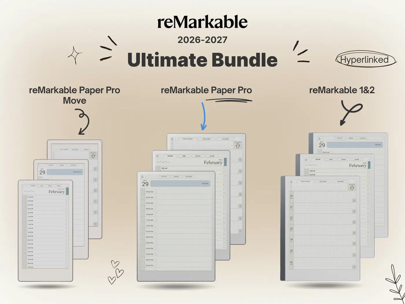
Stop fighting with scaled-down, blurry documents. Equip your 11.8″ color display with our Ultimate 2026 Template Bundle, engineered specifically for the 1620 x 2160 pixel grid. Featuring fully dated layouts, massive touch targets, and semantic color-coding.
Shop the 2026 Pro Bundle →