Hardware & Accessories
reMarkable Pro Templates 2026: The Ultimate Guide to Color & Size
The reMarkable Paper Pro changed everything. For years, the digital writing community was stuck in a monochrome world. We designed templates in grayscale, optimized for contrast, and ignored the color wheel entirely. But with the release of the Paper Pro and its stunning 11.8-inch Canvas Color display, the rules have been rewritten. Suddenly, “Red” isn’t just dark gray—it’s actually red.
However, this upgrade brings a new problem: your old files don’t work well anymore. The screen is larger, the resolution is higher, and black-and-white grids look boring on a device capable of so much more. You need specifically designed **remarkable pro templates**. In this guide, we explore how to find, buy, or build the perfect layouts for the new flagship device in 2026, ensuring you get every pixel of value out of your upgrade.

The Size Problem: Why Old Files Fail
The first thing you notice when you load an old PDF onto the new device is the fit. It’s wrong.
The reMarkable 2 had a 10.3-inch screen with a specific aspect ratio. The **remarkable pro templates** need to fit an 11.8-inch screen with a resolution of 1620 x 2160 pixels. If you use an old rM2 template, the device will try to scale it up. This often results in:
- Blurry Lines: The crisp 1px grid becomes a fuzzy 1.5px smear.
- Letterboxing: Annoying white bars at the top or bottom of the screen.
- Misaligned Toolbars: The safe zones are different, so your “Monday” button might be hidden behind the new floating menu.
To get the “paper-like” experience, the template must match the native resolution 1:1.
The Color Revolution
This is the most exciting shift for **remarkable pro templates**. We can finally use color coding.
Visual Hierarchy
On the rM2, we used bold text for headers and thin text for body. On the Paper Pro, we can use Blue for headers and Black for body. This mimics how our brains process information in textbooks. A template with a pale blue grid is far easier on the eyes than a stark black grid.
Status Indicators
Project management templates now include “Traffic Light” systems. You can circle a Green dot for “Done,” Yellow for “In Progress,” and Red for “Blocked.” This was impossible on previous generations.
For a deep dive into how E Ink handles color, read E Ink’s Gallery 3 technology page.
Technical Specs for Creators
If you plan to design your own **remarkable pro templates** using tools like Canva or Figma, you need these exact numbers.
| Spec | Value | Notes |
|---|---|---|
| Resolution | 1620 x 2160 px | Do not use A4 or Letter. |
| DPI | 229 DPI | Export at 300 DPI to be safe. |
| Color Mode | RGB | Stick to primary colors (Cyan, Magenta, Yellow, Black, Red, Green, Blue) for best saturation. |
| Margins | 120px Left/Right | To clear the new floating toolbars. |
Using gradients is risky. The Paper Pro uses dithering to create mixed colors, so a subtle grey-blue gradient might look grainy. Stick to solid blocks of color.
Best Template Types for Pro
What kind of **remarkable pro templates** should you look for in 2026?
- The “Blue Grid” Notebook: Mimics technical drafting paper. The blue lines fade into the background, letting your black ink stand out.
- The Eisenhower Matrix (Color): A 2×2 grid where “Urgent” is red and “Not Urgent” is green. It uses color psychology to drive action.
- The Weekly Dashboard: Uses colored boxes to separate “Work” (Blue) from “Personal” (Green) tasks visually.
These layouts leverage the hardware to reduce cognitive load.
Where to Find Pro Templates
The market is still catching up. Here is where to find true **remarkable pro templates**.
1. Official reMarkable Store
The device comes with updated native templates. reMarkable AS has done a great job updating their “Life” and “Creative” folders with color options. Check out the official product page for examples.
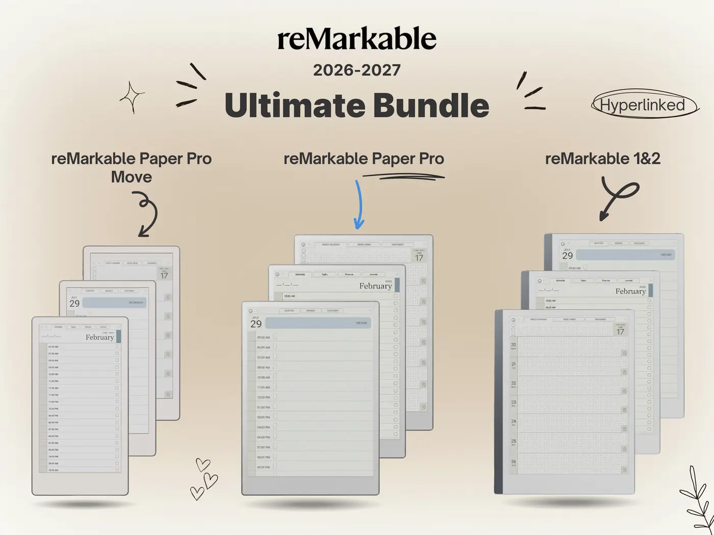
2. Templacity (Us)
We have updated our entire catalog. Our “Pro Bundle” is rebuilt from scratch at 1620×2160 resolution with optimized color palettes that don’t ghost.
3. Etsy (Buyer Beware)
Be careful on Etsy. Many sellers simply rename their old rM2 PDFs as “Pro Compatible.” While they will load, they won’t look right. Always check the description for “1620 x 2160” dimensions.
Final Verdict
Is it worth upgrading your library?
Yes. If you spent nearly $600 on the Paper Pro, using a fuzzy, black-and-white PDF is a waste of money. The experience of writing on a crisp, color-coded **remarkable pro template** is what the device was built for. It feels less like a computer and more like a magic sheet of paper.
Start with a simple blue-lined notebook and feel the difference. You won’t go back to grayscale.
Go Pro with Your Planning
Get the only template bundle designed specifically for the Canvas Color display. Crisp lines, perfect fit, and vibrant organization.