Kindle Scribe OneNote Integration: Ultimate Sync Guide
Kindle Scribe OneNote Integration: Ultimate Sync Guide Productivity & Tech Mastering Your Kindle Scribe OneNote Integration Workflow For professionals who live in the Microsoft ecosystem,
You have made the leap to the 11.8-inch Canvas Color display, stepping away from the distracting glow of an iPad in favor of deep, uninterrupted focus. However, finding the perfect reMarkable paper pro planner template is the most important step between owning a beautiful piece of hardware and actually getting your work done.

If you have upgraded from a 10.3-inch monochrome device, your immediate instinct will likely be to transfer all of your old PDF files to the new tablet. Before downloading a generic reMarkable paper pro planner template from a random forum, you must understand the scale and geometry of your new device. The flagship tablet operates on a massive 1620 x 2160 pixel grid at 229 DPI.
When you take a standard A4 document—or worse, a file designed for an Apple iPad—and force it onto this unique E-Ink display, the software has to algorithmically stretch or compress the image. This introduces blurriness. The razor-sharp lines that make digital paper look so authentic suddenly become jagged and fuzzy. Furthermore, scaling an unoptimized PDF places a heavy burden on the device’s processor, leading to sluggish page turns and annoying lag.
This is why a native reMarkable paper pro planner template is not a luxury, but a necessity. By utilizing a document exported at the exact 1620 x 2160 resolution, you bypass the scaling engine entirely. Every dotted grid, every margin, and every letter of text maps perfectly to the physical pixels on your screen. If you want a deeper dive into the technical specifications of this flagship device, read our comprehensive reMarkable Paper Pro Guide.
The defining feature of this tablet is its Gallery 3 color technology. However, E-Ink color behaves entirely differently from LCD or OLED color. Because the screen reflects ambient light (or utilizes its subtle active front light), heavily saturated graphics can look muddy and create severe “ghosting”—faint remnants of previous pages lingering on the screen.
A professionally designed reMarkable paper pro planner template uses semantic coloring. This means the core architecture of the document relies on high-contrast white backgrounds and dark grey lines, but features muted, pastel-colored tabs for navigation. For example, a soft blue tab might indicate the first quarter of the year, while a pale green tab indicates the second. According to documentation from the E Ink Corporation, this approach maximizes legibility and minimizes screen refresh times.

By keeping the layout minimalist, the right reMarkable paper pro planner template keeps the background stark white and invites you to provide the color. You can use the device’s red marker tool to circle urgent client deadlines or the yellow highlighter to mark completed project phases. This methodology is frequently praised by productivity experts at Wired for successfully reducing cognitive load during complex workdays.
When evaluating a new reMarkable paper pro planner template for the year, you must ensure it acts as a comprehensive database, not just a blank piece of digital paper. You need a system that enforces discipline and organizes the chaos of your professional life.
Look for the following architectural requirements:
Installing your new reMarkable paper pro planner template is straightforward, provided you follow the correct procedures. Do not attempt to email the file to yourself and open it via a third-party mobile app, as this can compress the PDF and destroy the intricate hyperlink metadata.
Always use the official desktop application or the built-in USB-C web interface. Simply drag and drop your downloaded PDF into the desktop app interface. Depending on your Wi-Fi network speed, syncing a comprehensive 800-page interactive PDF can take anywhere from 30 seconds to two minutes. The specialists at Good e-Reader recommend keeping your total file size under 20MB for optimal performance, a benchmark that premium template designers adhere to rigorously through vector optimization.
Keep a blank master copy of your reMarkable paper pro planner template in a safe folder on your device. Once you sync the original, duplicate it immediately. This ensures that if you want to start a completely fresh notebook for a different project, you don’t have to re-import the pristine file.
The tablet sitting on your desk is a masterpiece of industrial design. The active front light and the Canvas Color rendering are incredible technological achievements. But without the right software architecture, it remains an expensive, passive slate.
Investing in a true reMarkable paper pro planner template completely changes the utility of the device. It shifts the mental burden of organization off your shoulders and onto the tablet. It forces you to prioritize, time-block, and execute. If you want to get the return on investment that this premium hardware promises, upgrading your template system to match the screen’s capabilities is the single most important step you can take.
Leverage the MyScript handwriting recognition engine to convert your structured notes into text, and turn your digital notebook into a fully integrated part of your corporate workflow.
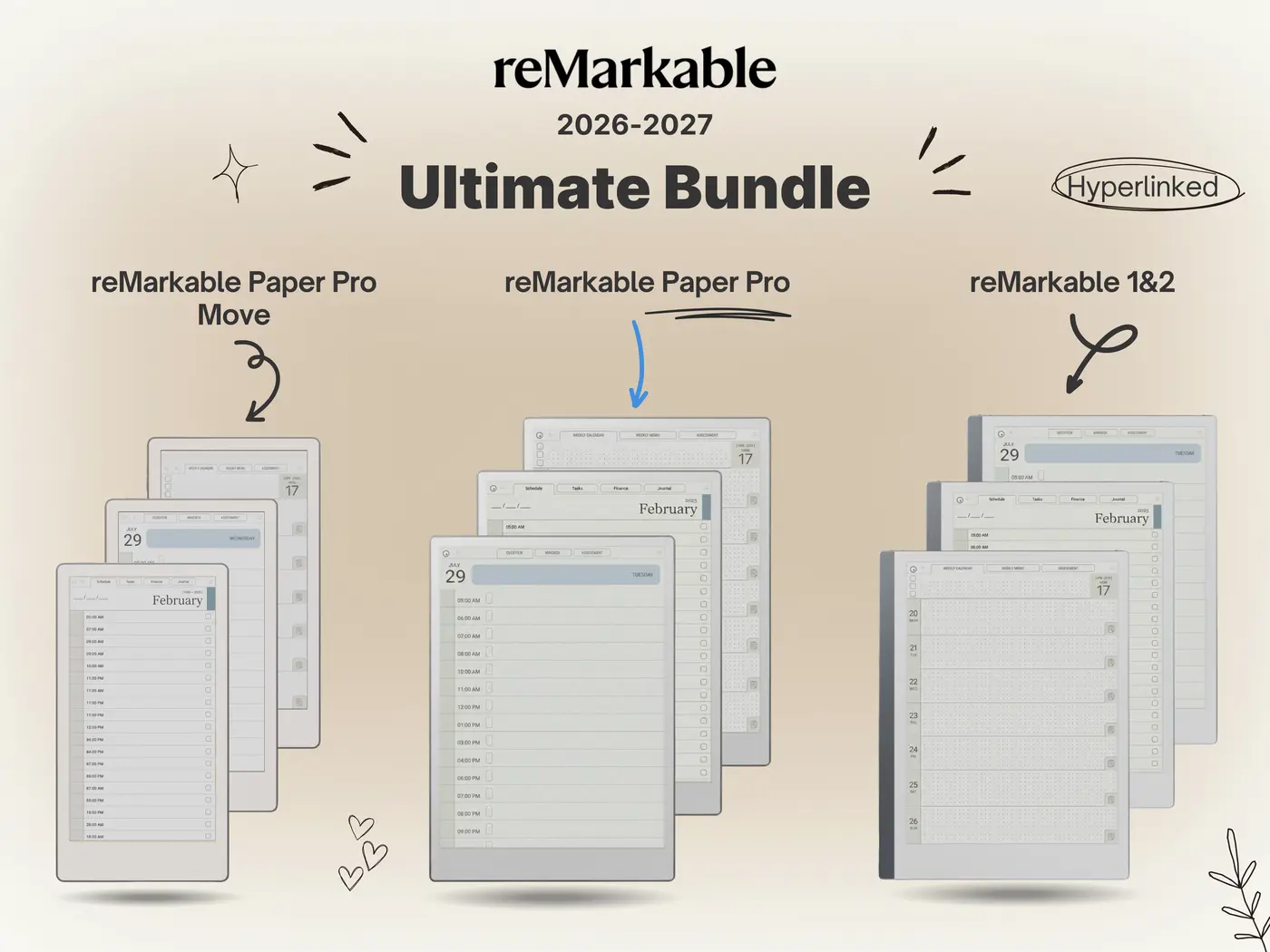
Stop fighting with blurry, scaled-down generic documents. Equip your 11.8″ Canvas Color display with our meticulously engineered system. We exclusively offer 2026 bundles featuring perfectly scaled 1620 x 2160 resolution, massive touch targets, and semantic color-coding.
Shop the 2026 Bundle →
2 Responses